|
|
Post by maghdalena on Oct 23, 2018 4:29:54 GMT
maghdalena , you got it. Kudos to you! You should be proud of your accomplishment. This kind of retouching requires patience; many times (as you learnt) it takes more than one pass with the Spot Healing Brush to get the job done. Yeah, I noticed, lol. Thanks, Sepiana. For everything.  I'm good here. Now to put the banner and the image together. I live for thrills.  Maghdalena |
|
|
|
Post by maghdalena on Oct 21, 2018 7:40:19 GMT
BTW, how big a brush should I use, a medium sized brush or what? When I tested your image, I used a 20 px brush. It worked just fine; I wouldn't go any larger. Sepiana, I gave it a shot, and at first, it didn't work but playing around with it, this is what I got:  Is this what you were talking about. I've found I have to be very patient with myself. I have ADHD, and spatial relationship issues so I wasn't sure if I got it right-finally, lol. I tried it in GIMP, but having issues with someone from those forum's directions as to the colors. He was talking about using a gradient, then came back to this one to try it again, and I had it on the wrong one, and tried it again, with the proximity thing(which was selected) and the brush at 20 pixels, and after about 5 minutes, I got it took a couple of passes, but I think I have it. Did I get the shade right? I feel much better. I was starting to feel intimidated. So I feel like I actually accomplished something tonight. Thanks a lot, and look forward to your perspective and advice. Thanks for your patience. Bright Blessings, Maghdalena |
|
|
|
Post by maghdalena on Oct 19, 2018 3:37:11 GMT
Great! As long as I know what *not* to select, that is, the yellow/gold area. That helps a lot, thanks, Sepiana. BTW, how big a brush should I use, a medium sized brush or what? (I thought of that question after posting the last question. Maghdalena Sepiana, OK, I just want to be sure I'm on the same page as you. Select the area to be retouched. That's the blue border and the smokey grey-blue area, right, before I select the spot healing brush. Is that correct? Yes, that's correct. You got it! |
|
|
|
Post by maghdalena on Oct 18, 2018 8:15:58 GMT
Sepiana, OK, I just want to be sure I'm on the same page as you. Select the area to be retouched. That's the blue border and the smokey grey-blue area, right, before I select the spot healing brush. Is that correct? Thanks, I wasn't sure. Maghdalena Is There a way to crop the smokey grey out and the blue or is there something better that can be done with the upper left corner, like making it the dark blue of the border, or what do you suggest? Did I use the wrong crop tool? I used the “Rule of thirds” cropping tool and got it as far as I could and as much of the left side out as possible, but I couldn’t get it all. What do I do with that left part because it looks unfinished? Could I just have the rest of it be blue like the dark blue border, or does or copy the color for the rest of the image? Does anyone have any suggestions or help on how to get rid of the greyish blue at least? I just want to know if I can actually do that or if I need to use a different image or start over with a different tool. If so, could you baby-step me through this? Hi maghdalena,
I am not really sure this is what you want. Give it a try!
1. Activate the Lasso tool (L). Make a selection of the area to be retouched.
2. Activate the Spot Healing Brush (J).
3. Set this tool to Proximity Match. (This setting will tell Elements to search the surrounding area for replacement pixels.)
4. Drag the brush over the area to be fixed.
NOTE:
Making a selection first gives Elements a helping hand; it limits the area where the Spot Healing Brush will search for replacement material.

|
|
|
|
Post by maghdalena on Oct 18, 2018 6:26:26 GMT
I tried it and tried putting it in, but this way isn't looking the way I was hoping. I like it, but it's just not right for the site. So I'm going to try the other way, that is using the lasso and healing spot brush. A shame, I really liked this one. Oh, well, Thanks anyway. I did find out that the background is transparent on the original image, though. Maghdalena You don't say what version of PSE you're using, and it's hard to tell exactly what you're trying to achieve, but one thing you could try is using the magnetic lasso tool to select the leftmost part of the image and then delete the selection. That would give you the rightmost part of the image to work with and the leftmost part transparent, like this:

Does that help?
|
|
|
|
Post by maghdalena on Oct 18, 2018 5:33:41 GMT
Oops, sorry, Major Major, It's Photoshop Elements 12. Hope that helps. I really like this idea too. It looks awesome! I almost like that better! It's funny I was thinking of that blue border myself:) I'd really like to try both, then I'll pick the one I like most and goes the best with the blue overlay. (See Build Confidence Easily) Maghdalena You don't say what version of PSE you're using, and it's hard to tell exactly what you're trying to achieve, but one thing you could try is using the magnetic lasso tool to select the leftmost part of the image and then delete the selection. That would give you the rightmost part of the image to work with and the leftmost part transparent, like this:
Does that help?
|
|
|
|
Post by maghdalena on Oct 18, 2018 5:19:41 GMT
Yes, this the image on the right is exactly what I'm talking about! I'll give this a try over the weekend, so thanks for helping me out. I was so scared I wouldn't be able to do it. Thanks, and I'll let you know how it goes next week. Maghdalena Is There a way to crop the smokey grey out and the blue or is there something better that can be done with the upper left corner, like making it the dark blue of the border, or what do you suggest? Did I use the wrong crop tool? I used the “Rule of thirds” cropping tool and got it as far as I could and as much of the left side out as possible, but I couldn’t get it all. What do I do with that left part because it looks unfinished? Could I just have the rest of it be blue like the dark blue border, or does or copy the color for the rest of the image? Does anyone have any suggestions or help on how to get rid of the greyish blue at least? I just want to know if I can actually do that or if I need to use a different image or start over with a different tool. If so, could you baby-step me through this? Hi maghdalena,
I am not really sure this is what you want. Give it a try!
1. Activate the Lasso tool (L). Make a selection of the area to be retouched.
2. Activate the Spot Healing Brush (J).
3. Set this tool to Proximity Match. (This setting will tell Elements to search the surrounding area for replacement pixels.)
4. Drag the brush over the area to be fixed.
NOTE:
Making a selection first gives Elements a helping hand; it limits the area where the Spot Healing Brush will search for replacement material.
|
|
|
|
Post by maghdalena on Oct 17, 2018 9:12:55 GMT
I was wondering if someone could help me with this. I have a header that I'm trying to put together for a site that has to do with confidence. It's part of the Astra Starter Sites. This is the original header:  The image said its original size is 1920 X 500 pixels, but saving the image I got 1024X267 px. The image has an all-white background with the picture on the far right because there’s a blue overlay with text on the left. This is the image I’m working from:  What I want to do is crop the left part out, and just leave the right side with the woman and the text “Victory begins with Confidence” with the gold(It was professionally done by someone at Fiverr), but when I cropped it, this is what I got:  Is There a way to crop the smokey grey out and the blue or is there something better that can be done with the upper left corner, like making it the dark blue of the border, or what do you suggest? Did I use the wrong crop tool? I used the “Rule of thirds” cropping tool and got it as far as I could and as much of the left side out as possible, but I couldn’t get it all. What do I do with that left part because it looks unfinished? Could I just have the rest of it be blue like the dark blue border, or does or copy the color for the rest of the image? Does anyone have any suggestions or help on how to get rid of the greyish blue at least? I just want to know if I can actually do that or if I need to use a different image or start over with a different tool. If so, could you baby-step me through this? I'd be much obliged. Any help would be appreciated. Thank you for your time. Sincerely yours, Katherine M. Logan BTW, it’s the header for the internal images. The website is buildconfidenceeasily.com |
|
|
|
Post by maghdalena on Apr 14, 2017 4:36:54 GMT
Cat, I found another video that explained it better, and I think I have it. It's different than the way you suggested, but I got it! Unless I forgot something, I can delete the template and upload it to YouTube for Rick. Hopefully the red won't be drowned out by the black background. He likes them a little spartan. See Screenshot. This worked much easier. I'm not sure I understood your directions, but I understood the fellow on the video, Hoot Unboxings, pretty easily. But I do remember you mentioning that there was more than one way to do things in PSE, and we all have our favorite ways. You are so right. Again, thanks. Maghdalena A psd template usually has layers. It's always the best option to choose with Photoshop or Photoshop Elements. However, from the look of your layer's panel, it doesn't look like there are layers in your template. The bottom layer is just a blank layer and the other two are the same layer duplicated so there's really no help there except for the overall size of the project and the fact that the box for the text/logo is delineated for you. The simplest way to color the background of only the text box is to grab the marquee tool and put a selection around the box - then open a new layer above your template and fill this selection with color. It will cover up your template box, but that is alright. Then hit control/command D to get rid of the selection. While on the top layer, grab the text tool, change the color of the text, and start typing. If you forget to change the color of your text to make it stand out from the color you filled the box with - you will think there is no text - it's just not visible because it's the same color as the box. If you are only going to use a few words, a text box is not necessary, but if you trying to confine a lot of text into one area, a text box works well. (To draw out a text box, grab the text tool, and similar to the marquee tool, draw out a box. Click inside the box and start typing. Your text will be confined to that text box. Click OK and the text box selection will disappear.) Adding photo or graphics to your background text box is as simple as copy/pasting or drop/dragging. You must be on top of the background because - remember - you are stacking things. Think of layers as pieces of glass - if a solid layer is on top of a not solid layer - that solid layer will cover up everything on the layer below.Use the move tool to resize the graphic/photo and to move it around. If you are having trouble moving something around, sometimes it helps to use the Transform part of the move tool. Just hit Control/Command T and Transform will be initiated. Click OK when you have your placement.
Realize that if you are trying to stack things on background, if you use a jpg, you may have a white box around your graphic. If you use a png with transparency around the graphic, it will blend into the background. A png preserves transparency, a jpg does not.   |
|
|
|
Post by maghdalena on Apr 14, 2017 4:30:08 GMT
Moto, Actually, the measurements by YouTube is: 2560 X 1440, because it's on 3 devices, TV, Tablet, Desktop and Mobile. I don't know if that helps. I have the background, and the pictures in, but I'm having trouble putting the text layers in for some reason. I like your design btw, but this what my husband wanted, for the images, then the text in the Middle would be: "Eden APPLE" with Eden in yellow and apple in red" “Love is friendship, set on fire.” - Jeremy Taylor I think I have it I found a way to do it. (See screenshot below. I think all that remains is deleting the template layer unless I'm missing something. As I said, very simple. Hopefully this red won't be drowned out by the background, lol. Thanks. I hope this helps. You Tube Channel Header Image1. File menu - New - Blank File Width: 1546 Height: 426 Background Contents: Transparent 2. Make Background Color Black Tool Bar: Color - foreground black Tool Bar: Using the Paint Bucket tool click on the image checkerboard. 3. New Layer for Text Layer menu - New - Layer Tool Bar: Click T for text Color: yellow. Click on image, type your text and click the check mark. Position your text by using the Tool Bar: Move tool. To resize text use the Move tool by grabing and moving a corner. 4. Repeat Step 3 changing the color, screen location and text. 5. Add Image Files. Open your 2 image files. Then click on the Photo Bin icon on the bottom left corner of Elements 12. Click, hold and drag one image to the main image in the editor window. Now position image with the Move tool. Repeat to move the second image to the main image. 6. Resize images if necessary. Use the Move tool by grabbing and moving a corner.  Apples form pixabay. |
|
|
|
Post by maghdalena on Apr 10, 2017 4:54:53 GMT
I hope someone can help me. I need to design a YouTube Header for my husband, and I'm really having a lot of trouble with Picmonkey, so thought I'd try with Photoshop Elements 12. I got as far as setting it up, and have the template in, but I can't put anything over the template like i can with Picmonkey. I need the template as a guide, but can anyone help me. I'm so frustrated, but I'm sure there's a way to do this. It's not going to be a complicated one like in the YouTube videos which I have trouble following and understanding, but just text, and an image on both sides. Here is my first screenshot which I have so far, and then I got stuck. Can anyone walk me through it. I'd like a black background, with yellow and red letters and the two images on each side (with the text in the middle)  upload pic upload pic Do I need to start over? How can I do this with the least amount of frustration? BTW, I used the .PSD template. Should I have used the .PNG? When I tried that, I could kind of put colors on it with the bucket, but the opacity isn't working, so I "undid" it, and now it won't work at all, so still frustrated. So I'm still doing something wrong. Still need someone to baby-step me through this. Any help would be appreciated. Thanks for your patience and help. You've always been very helpful. (I'm not the most artistically minded) Sincerely yours, Katherine Logan, AKA Maghdalena Save |
|
|
|
Post by maghdalena on Nov 15, 2016 6:37:34 GMT
Jan, I'll give the grid a shot. I did actually get a copy of Digital Scrapbooking in Easy Steps, and I have a copy of Photoshop CS2 in Easy Steps, as we have a copy of that program. It's pretty old though. The name we want to put on for the "Alien Homage" is actually 'Algol" Will the "G" make it harder? Projects give me practical experience, so you're definitely right there. One of the projects I'd like to do, not related to this one is a "Vision Board", so that scrapbooking book will actually be pretty helpful. I'm looking through it. Just wanted to touch base. I'll try to remember what you said too about not being judgmental about the different ways to do a project. Again, thanks for the recommendation on that book. (I got it used). Thanks again. When you turn on the grid, the lines will be a schematic for where to draw your lines. Grab the pencil tool and choose a grid line - hold down the shift key - click on one of the grid lines, while holding down the left mouse button and drag your line. Holding down the shift key allows for a straight line. If you do not hold down the shift key, you get a free hand line. Drawing the template first gives you parameters for each text box. The only way to learn is to try all sorts of things and see what happens. There are many ways to accomplish a task. None of them is bad. We all have our favorite ways. We learn them accidentally or by reading tutorials or hints from fellow users. You are approaching learning by trying projects. I think that is the best way to learn. It's all about trial and error. You see how things work and you develop your own favorite ways of doing things. My best advice is always keep things on their own layers. Many times during a project, you decide to go in a different direction. If each step is on it's own layer, you simply erase your layer and try it another way. I learned PSE using a book called "Digital Scrapbooking in Easy Steps". It was filled with simple projects and while you completed the projects, you were learning how the tools worked. Up until then, I was baffled. Your approach- doing projects - is the best way to learn. You'll get there. It's just that this software is not intuitive. It's based on a graphic design program for pros. It's inherently difficult, but well worth the learning curve. |
|
|
|
Post by maghdalena on Oct 28, 2016 5:28:28 GMT
Jan, I misunderstood your directions earlier. I'll try it your way, OK. It sounds sensible. I don't actually know how to do any of these steps. The only layer I know how to do was the first layer, the background layer, after that, I'm totally lost. If where you stripe is up for grabs, you can wait to stripe. But if you want symmetry and fixed sizes, eyeballing where to put the text will be difficult without having borders for each text box. Of course, this is all a learning experience, so try it both ways. If, after doing your grid, you find it distracting, the grid layer can be shut off. Personally, I could not do it text first, then grid, that's why I suggested doing grid first. |
|
|
|
Post by maghdalena on Oct 27, 2016 5:09:33 GMT
Thanks for your prompt reply, first, Jan. My husband wanted to ask wouldn't it be simpler to do this in reverse, that is the title, then then strip it down? (once I get the first layer in of course? What do you think? First layer will be a solid color, second layer the lines, third layer the text (however, you may want to keep each box's text on it's own layer) First, turn on the grid - you'll find it the same place you found the rulers. View> Grid
The grid divisions can be adjusted by going to Preferences> Guides and Grid However, it is likely your divisions/spacing on the grid may work without changing. There is a pencil to draw lines. Holding down the shift key while you draw allows you to draw a straight line. You can also draw a straight line by clicking - once at the beginning point, once at the ending pointRealize, the rulers will also work for this, but take a look at the grid to see if you like that better. Then work on your text. That will take some work and the right font, but I am sure you can do it. |
|
|
|
Post by maghdalena on Oct 27, 2016 4:56:36 GMT
What program do you use to animate? And how do you do that? It's something to think about and it looks real cool! Also, wouldn't it be easier to start with the title, then animate and covering with the boxes, and whatever? Not to tell you your business, of course. You guys and gals have a lot more experience than I do at this point. Hi maghdalena , When you come to do the text you could always cover up the bits of the font with boxes the same colour as the background which you then take away as you animate - this might be easier than drawing the font from scratch using lines Mark 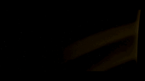 |
|


 I'm good here. Now to put the banner and the image together. I live for thrills.


