|
|
Post by Tpgettys on Aug 16, 2015 19:41:49 GMT
This Tutorial is for Photoshop, but I found I could follow it without any meaningful adjustments in PSE13. It allowed me to create a lake in the middle of Joshua Tree National Park (Image from MorgueFile). It uses several tools that I do not use in my typical workflow, so it was helpful learning about them, as well as learning a very cool effect! You can click the image to see an enlarged view.
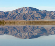
I am looking forward to seeing your creativity reflected in your posts!
Here is a write-up of this tutorial from Julie that is more specific to Elements: Creating Water Reflection.pdf (520.38 KB)
|
|
Squirrel2014
Established Forum Member
  Where's that cup of tea ... ???
Posts: 685  Open to constructive criticism of photos: Yes
|
Post by Squirrel2014 on Aug 17, 2015 23:22:14 GMT
Well, I'm not too sure about any creativity but at least I've got through the tutorial  I'll hopefully be able to have another attempt - maybe even with some imagination  So, in the meantime, here's my contribution! The image is from Morguefile 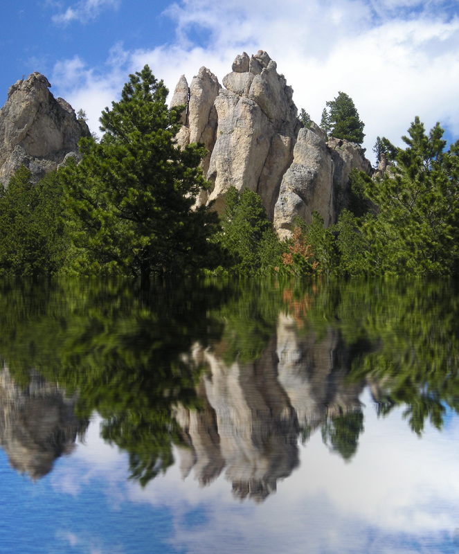 |
|
Squirrel2014
Established Forum Member
  Where's that cup of tea ... ???
Posts: 685  Open to constructive criticism of photos: Yes
|
Post by Squirrel2014 on Aug 18, 2015 0:18:39 GMT
I thought I'd try another one. This is one of my young cats sitting on the top of a Scratching Tree I messed around with some of the numbers, in the attempt to get it to look more like water  I think there must have been quite a strong undercurrent. Just as well she didn't jump in for a swim, eh?  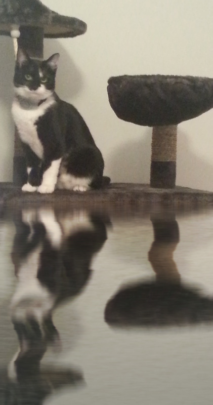 |
|
|
|
Post by Tpgettys on Aug 18, 2015 0:23:43 GMT
The outdoor image has a quiet, serene feel to it; the effect is quite believable. The cat image, well, I just feel bad about all the damage the flood has caused!
|
|
|
|
Post by blackmutt on Aug 18, 2015 1:19:25 GMT
|
|
Squirrel2014
Established Forum Member
  Where's that cup of tea ... ???
Posts: 685  Open to constructive criticism of photos: Yes
|
Post by Squirrel2014 on Aug 18, 2015 8:30:44 GMT
The cat image, well, I just feel bad about all the damage the flood has caused! She should have pulled the plug when the water started coming in .....  |
|
Squirrel2014
Established Forum Member
  Where's that cup of tea ... ???
Posts: 685  Open to constructive criticism of photos: Yes
|
Post by Squirrel2014 on Aug 18, 2015 8:32:50 GMT
Blackmutt You've got the water appearance just right. It looks so realistic. I like the way you've extended the water too  |
|
verber10
Junior Forum Member
 Best wide-angle lens? Two steps backward. Look for the 'ah-ha'. The Mitten State
Posts: 204 
|
Post by verber10 on Aug 18, 2015 14:59:06 GMT
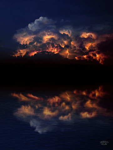
Thanks Tom for the tutorial. This seems like a good way to add water to a seen. Good job everyone.  Image from freeimages.
 |
|
|
|
Post by ritage on Aug 18, 2015 19:35:08 GMT
Tom, thanks for finding this. There are a number of little tricks in this tutorial I never heard of before. I had just realized I had to take detailed notes before attempting it, when I saw that Julie had done it for us. That was a lot of work and it's perfect.
Thank you very much, Julie.
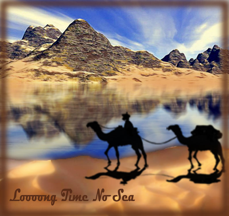
|
|
Squirrel2014
Established Forum Member
  Where's that cup of tea ... ???
Posts: 685  Open to constructive criticism of photos: Yes
|
Post by Squirrel2014 on Aug 18, 2015 19:51:34 GMT
ritage You're so welcome. I'm pleased you found it helpful - that was the purpose of doing the 'cheatsheet'. I hope you found the instructions accurate but, if not, please let me know so it can be amended. I hope others find it helpful too. I love what you've done here. The mirage is just fantastic!  |
|
Madame
Established Forum Member
 
Posts: 504  Open to constructive criticism of photos: Yes
|
Post by Madame on Aug 18, 2015 20:59:25 GMT
I love the entries here. So different and so creative! I have worked with my new App; Affinity, and it's quite a learning curve, it's different from Photoshop and Elements. I'm not sure if I'm so happy with the result.  |
|
|
|
Post by ritage on Aug 18, 2015 21:11:38 GMT
Julie, you just made my day! You saw my entry as a mirage. That's what I intended, but wasn't at all sure it really expressed that idea.
I noticed nothing in your cheatsheet that needs to be amended, and the screenshots were an extra bonus.
Thank you, Rita. |
|
|
|
Post by Tpgettys on Aug 18, 2015 21:18:25 GMT
Yes, some very nice renderings, and the mirage postcard is too funny!
|
|
Squirrel2014
Established Forum Member
  Where's that cup of tea ... ???
Posts: 685  Open to constructive criticism of photos: Yes
|
Post by Squirrel2014 on Aug 18, 2015 21:44:24 GMT
Julie, you just made my day! You saw my entry as a mirage. That's what I intended, but wasn't at all sure it really expressed that idea.
I noticed nothing in your cheatsheet that needs to be amended, and the screenshots were an extra bonus.
Thank you, Rita. Yes, as soon as I saw your image, I immediately saw this as a mirage. No doubt there. I'm sure others will too. It looks how I would expect a mirage to look like, not that I've ever seen on, in spite of working in Saudi Arabia and had trips into the dessert  I haven't yet worked out how you did your image, especially with the way you have sand at the forefront so, if you feel like sharing, I would love to know so I could try something like your effect. Thanks for confirming that you were able to follow the cheatsheet too. I like to add screen shots too as, when I come to look at the directions at a later date, I would like to be able to follow them again!  Julie |
|
|
|
Post by ritage on Aug 18, 2015 23:44:05 GMT
Julie, Funny you saying that. I was thinking that, though I travelled a lot in our southwestern deserts, I never saw a mirage either. Neither heard of anybody who has. Maybe they are a poetic phantasy?
I made two separate images.
1. completely finished the Water Reflection of the mountain image. 2. put this at top of a much larger canvass. 3. from a second desert image selected a suitable area and placed it at bottom, partly overlapping. The earth tones did not match well and I put blurred, low opacity, color overlays from No 2 on No 1 to darken. Couldn't find anything closer. Lightened No 2 and blurred it a lot because the light hit little ridges from the wrong direction. 4. merged all layers, cut off surplus areas all around and reduced size.
The figures are a brush by Gamarai (don't remember where I got it). The shadows unfortunately also fall in the wrong direction. When I was completely finished I realized I could have flipped the shadows by themselves vertically (cutting them off) and put them on the other side. But since it's all to be imaginary anyway it probably doesn't matter (read: I was too lazy to pull it all apart again  ). ).
None of this was difficult, just took quite a bit of time. Let's see something you try.
Rita
Both images from MorgueFile
P.S. I had a quote at top, but it got lost.
|
|