|
|
Post by Sepiana on Mar 9, 2016 6:11:31 GMT
Hi everyone,
I would love to see what you can do with this starter image. Let your creative juices flow and . . . don’t forget to have fun!
Image source: freeimages

|
|
Moto
Established Forum Member
 
Posts: 662  Open to constructive criticism of photos: Yes
|
Post by Moto on Mar 9, 2016 20:05:51 GMT
Say Yes to Reading Outdoors

NYC, Central Park, Bethesda Fountain, sitting on the Bethesda Terrace. There's a bird in the sky. Background photo by Tony C., taken 2016 03 19.
|
|
|
|
Post by Lillias on Mar 9, 2016 21:46:38 GMT
Great image Sepiana. Got the scrapper working in me... Kits Used - Craftscapes Country Gdns, Twilight Forest and People from Daisytrail.  |
|
|
|
Post by Sepiana on Mar 10, 2016 0:27:58 GMT
Moto - You got this challenge to a great start. I really like the background image you used. It ties in with the starter image so well. Beautiful colors!
BillieJean - This would make a wonderful illustration for a children's book. Very nice composite!
|
|
|
|
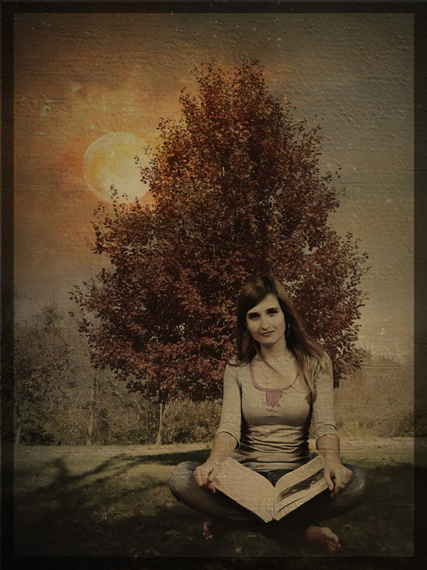
Post by Sepiana on Mar 10, 2016 5:27:45 GMT
- Used one of my own images for the background. - Ran the file through Topaz Texture Effects.
- Applied a texture by Lenabem-Anna J.
- Applied a texture by Jerry Jones.
- Ran the file through ON1 Photo 10 to create the border effect.

|
|
|
|
Post by Lillias on Mar 10, 2016 13:40:52 GMT
This is beautiful Sepiana. Love the texture and the shading. Your lady looks quite at home sitting there with her book.
|
|
|
|
Post by ritage on Mar 10, 2016 20:07:59 GMT
Nice places to read in and beautifully represented. Library image from Pixabay  |
|
Moto
Established Forum Member
 
Posts: 662  Open to constructive criticism of photos: Yes
|
Post by Moto on Mar 11, 2016 1:56:34 GMT
|
|
|
|
Post by whippet on Mar 11, 2016 21:00:23 GMT
|
|
|
|
Post by PeteB on Mar 12, 2016 3:51:34 GMT
|
|
|
|
Post by Sepiana on Mar 12, 2016 4:37:47 GMT
This is beautiful Sepiana. Love the texture and the shading. Your lady looks quite at home sitting there with her book. BillieJean, thanks for the kind words! I was afraid I got a bit carried away with the textures. |
|
|
|
Post by Sepiana on Mar 12, 2016 4:52:13 GMT
Rita - You got this young lady in the perfect place. I can envision this image on the wall of a classroom or of a library encouraging kids to read. I am curious about the unusual border effect. How did you do it?
Moto - What a colorful composite! This would make a wonderful poster for a reading campaign. I am curious. How did you create the polka-dot background? It's an interesting effect.
whippet - This is beautiful! I really like how you placed this young lady between the two statues. Very clever!
Peter - WOW! What a portrait! You really took this image to another level.
|
|
Moto
Established Forum Member
 
Posts: 662  Open to constructive criticism of photos: Yes
|
Post by Moto on Mar 12, 2016 19:35:12 GMT
Moto - What a colorful composite! This would make a wonderful poster for a reading campaign. I am curious. How did you create the polka-dot background? It's an interesting effect. Graphics Panel/Backgrounds - Big Dot. Using PSE 14. |
|
|
|
Post by ritage on Mar 12, 2016 19:59:07 GMT
Rita - I am curious about the unusual border effect. How did you do it? I didn't make this myself. It's one of a set of more than a hundred frame presets called 'sc-edge', which I downloaded years ago, but have no idea where from. Just now tried Google to find them, but no luck. Rita |
|
|
|
Post by Lillias on Mar 12, 2016 20:06:56 GMT
Rita - I am curious about the unusual border effect. How did you do it? I didn't make this myself. It's one of a set of more than a hundred frame presets called 'sc-edge', which I downloaded years ago, but have no idea where from. Just now tried Google to find them, but no luck. Rita I also have these and got them from this link graphicssoft.about.com/od/freedownloads/l/blframes_t01.htm |
|