|
|
Post by Tpgettys on Mar 28, 2016 0:20:44 GMT
So many fine takes on this tutorial; thank you all for giving it a go! The incorporation with the scrapbooking kits really take it to a higher level.
|
|
|
|
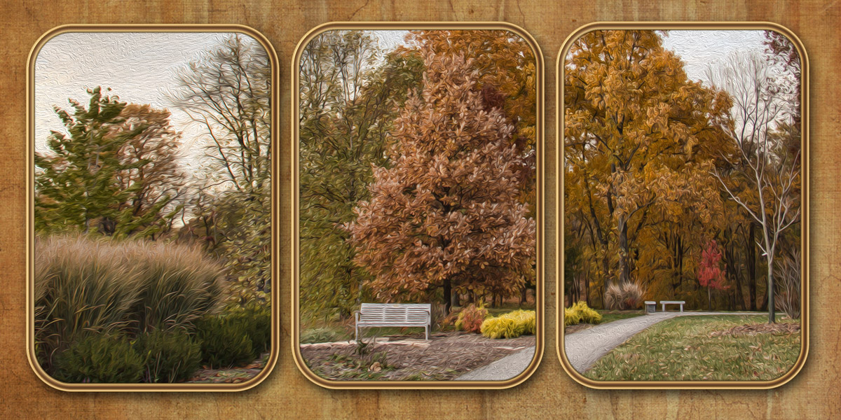
Post by Sepiana on Mar 28, 2016 3:32:21 GMT
- Created the painting effect with the Oil Paint filter.
- Applied a frame layer style by Jodi.
- Applied a Flypaper texture on the background.
 |
|
|
|
Post by Tpgettys on Mar 29, 2016 3:57:43 GMT
Nicely done triptych Sepiana, and thanks for sharing your variations!
One thing I noticed that is different about this approach from other ways of making a triptych I have seen is that none of the source image is lost. That would seem to be a plus, but then I wonder if there could be a visual disconnect by separating panels that were adjacent. What do you think?
|
|
|
|
Post by cats4jan on Mar 29, 2016 12:34:17 GMT
I don't think it's as much visual disconnect as it is turning one photo into a grouping of pictures as opposed to one photo divided into three parts. It's all about how far apart you pull the sections and what you do with the sections, i.e., putting frames around such as Sepiana did. I am surprised at how good the photo divides in each of these examples no matter whether we keep them closely aligned or if we frame them. I'm guessing that's because we've chosen photos we know will divide well.
I really like this look and can see this being a great way to make art for a wall. That's the feeling I get when I see Sepiana's example, as well as your first example, Tom. In fact, most of these would make great wall art.
|
|
Squirrel2014
Established Forum Member
  Where's that cup of tea ... ???
Posts: 685  Open to constructive criticism of photos: Yes
|
Post by Squirrel2014 on Mar 29, 2016 23:08:00 GMT
And now for something completely different - a little wave I'm having great difficulty in working out how these shapes were made and then used. Fotofrank, you pasted a screen shot of your shapes but, although that's helped me visualise the process a bit, it's not enough for me to be able to replicate it. Not that I specificaly want to copy your style but I would love to be able to make/create a variety of shapes etc. Would you, fotofrank, or someone else, be happy to help me out here, please? I'm so sorry to be so dense  Many thanks Julie |
|
|
|
Post by Sepiana on Mar 30, 2016 2:19:05 GMT
I am surprised at how good the photo divides in each of these examples no matter whether we keep them closely aligned or if we frame them. I'm guessing that's because we've chosen photos we know will divide well. Janice,
I believe you hit the nail on the head. It has been my experience that the key ingredient to creating a triptych effect is not the use of the whole image (or part of it), the distance between the panels, or if the panels have effects added to them (strokes, frames, bevels, drop shadows, etc.). The key ingredient is the kind of image you use to create this effect.
|
|
|
|
Post by Lillias on Mar 30, 2016 11:33:13 GMT
I'm having great difficulty in working out how these shapes were made and then used. Fotofrank, you pasted a screen shot of your shapes but, although that's helped me visualise the process a bit, it's not enough for me to be able to replicate it. Not that I specificaly want to copy your style but I would love to be able to make/create a variety of shapes etc. Would you, fotofrank, or someone else, be happy to help me out here, please? I'm so sorry to be so dense Sorry I'm not Fotofrank but I have been struggling with this too Julie and this is how I've been able to do it. I believe if PSE had a pen tool it would be much easier. Draw out a fairly fat and long rectangle with the rectangular marquee tool and fill it with a colour. Duplicate that and go to Filter > Distort > Shear and work with the line till you see something that approximates what you want and click ok. That gives you the middle section of the wavy triptych. Duplicate that and draw a rectangle selection down one side of it to get your straight edge and click delete. I think you can figure out the rest from here. As to other shapes - well...brain hurts...lol. 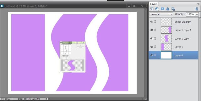 |
|
Squirrel2014
Established Forum Member
  Where's that cup of tea ... ???
Posts: 685  Open to constructive criticism of photos: Yes
|
Post by Squirrel2014 on Mar 30, 2016 15:21:32 GMT
BillieJean:
Draw out a fairly fat and long rectangle with the rectangular marquee tool and fill it with a colour.
Duplicate that and go to Filter > Distort > Shear and work with the line till you see something that approximates what you want and click ok. That gives you the middle section of the wavy triptych.
Duplicate that and draw a rectangle selection down one side of it to get your straight edge and click delete. I think you can figure out the rest from here.
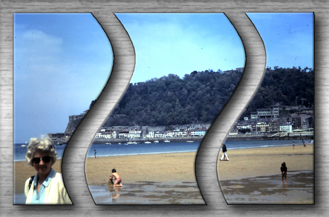 Many thanks, BillieJean. These instructions were enough to get me further. I did try using the Shear feature but I just couldn't get my head around it and so didn't end up with any decent shapes. Maybe it was too late at night. I seem to have grasped it better today. This is not a good image for this exercise (my mum, in Spain, many years ago!) but at least I have managed to finish it.  However, I still have some issues with all this, such as how to create this 'template' to a particular size? I wasn't sure how to clip to each shape so I decided to merge them and try that and it worked fine. I suppose I could have just used the Move tool and adjusted the size. Doh! I didn't think of that till just now  Experimenting and practicing is most likely the answer, eh?  So, now for trying to create some 'different' shapes etc. Fotofrank is going to get back to me too so it will be interesting to see what his methods involved. Many thanks, Frank. Looking forward to hearing from you. Many thanks Julie |
|
|
|
Post by Sepiana on Mar 30, 2016 17:00:42 GMT
I wasn't sure how to clip to each shape so I decided to merge them and try that and it worked fine. Julie, you may want to check this Adobe document from the Help file. Hope it helps!
Clipping masks
|
|
Squirrel2014
Established Forum Member
  Where's that cup of tea ... ???
Posts: 685  Open to constructive criticism of photos: Yes
|
Post by Squirrel2014 on Mar 30, 2016 18:44:54 GMT
I wasn't sure how to clip to each shape so I decided to merge them and try that and it worked fine. Julie, you may want to check this Adobe document from the Help file. Hope it helps!
Clipping masks
Thanks, Sepiana. That's an excellent article. However, it doesn't actually address what I was trying to say. Maybe I didn't explain it very well. I made 3 shapes, as per fotofrank and BillieJean illustrated, each on a different layer, which were filled in with a colour. So, when I put my photo in, I needed to clip the photo to the 3 shapes. I wasn't sure how to do this, being the same but larger photo to be clipped to the 3 shapes, so I merged the three layers and then clipped them. I was wondering, is there an easier/better way to achieve this? I just felt I might have 'missed' something  Julie |
|
|
|
Post by Lillias on Mar 30, 2016 18:55:17 GMT
Julie have a look at this one I did in the Scrapbooking Thread a wee while back. You will have to scroll down nearly to the bottom of the first page in the Thread. I included a screen shot of my Layers. You will see the shapes on different layers and above each layer shape is a copy of the photo. Hope this helps... photoshopelementsandmore.com/thread/2050/scrapbook-challenge-03 |
|
|
|
Post by Sepiana on Mar 30, 2016 20:31:17 GMT
Thanks, Sepiana. That's an excellent article. However, it doesn't actually address what I was trying to say. Maybe I didn't explain it very well. I made 3 shapes, as per fotofrank and BillieJean illustrated, each on a different layer, which were filled in with a colour. So, when I put my photo in, I needed to clip the photo to the 3 shapes. I wasn't sure how to do this, being the same but larger photo to be clipped to the 3 shapes, so I merged the three layers and then clipped them. I was wondering, is there an easier/better way to achieve this? I just felt I might have 'missed' something ![;)]() Julie
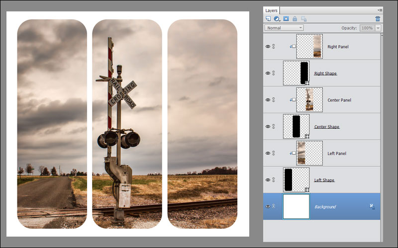
Sorry, Julie! Let's see if I understood it now -- one photo, three shapes, each shape on its own layer.
Here is the way I do it. I find it very easy.
- Create the three photo panel layers. - Create the three shape layers. - Move the photo panel layers around in the Layers stack so that each panel layer will be directly above its corresponding shape layer. - Create the clipping masks.
 |
|
Squirrel2014
Established Forum Member
  Where's that cup of tea ... ???
Posts: 685  Open to constructive criticism of photos: Yes
|
Post by Squirrel2014 on Mar 30, 2016 21:11:05 GMT
Hi and thanks to both BillieJean and Sepiana You've both explained it all extremely well and I can now appreciate there is more than one way (isn't there usually?  ) and pros and cons for both methods. I'm pleased to say that I feel I understand it all so much better than I did, which is what I had hoped I'd achieve. Your examples are brilliant and are so inspiring, BillieJean, I took a look at the thread you posted the link for. Strange, I don't remember reading that thread but I remember seeing some of the images! Umm, I think my memory is maybe worse than I thought it was  Anyway, I've made a note of it and I'll work through it properly. I can only think something else was my priority at the time, or I was particularly tired  Thanks for pointing it out again. Many thanks to both of you. I've really learnt a lot in the last couple of days  |
|
rapata
Junior Forum Member

Posts: 246 
|
Post by rapata on Mar 31, 2016 3:43:24 GMT
This afternoon I took some time off spring cleaning to try this technique which could become addictive. The image is from our recent RV trip in Ajo Arizona, which has a beautiful old Spanish style plaza. 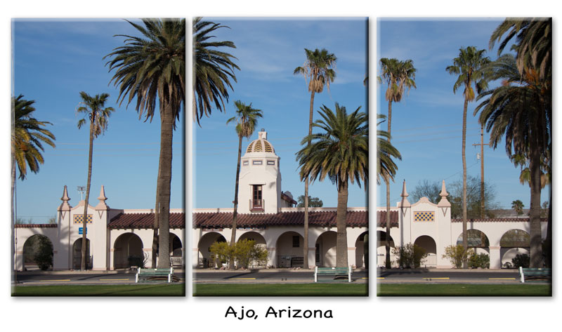 |
|
Moto
Established Forum Member
 
Posts: 662  Open to constructive criticism of photos: Yes
|
Post by Moto on Mar 31, 2016 6:47:21 GMT
Alternative to a straight border on the left and right sides.
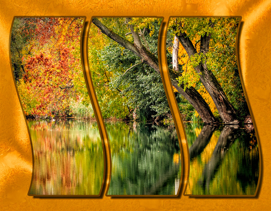 image = pixabay and orginal bkgrd image (used for texture only) = morguefile Billie Jean thanks for the technique. Julie, I did the same thing that you did, combine the 3 photo masks in one layer before clipping only one image to it. The lost in the image gaps doesn't matter with this image. |
|