Madame
Established Forum Member
 
Posts: 504  Open to constructive criticism of photos: Yes
|
Post by Madame on Jul 6, 2015 22:01:12 GMT
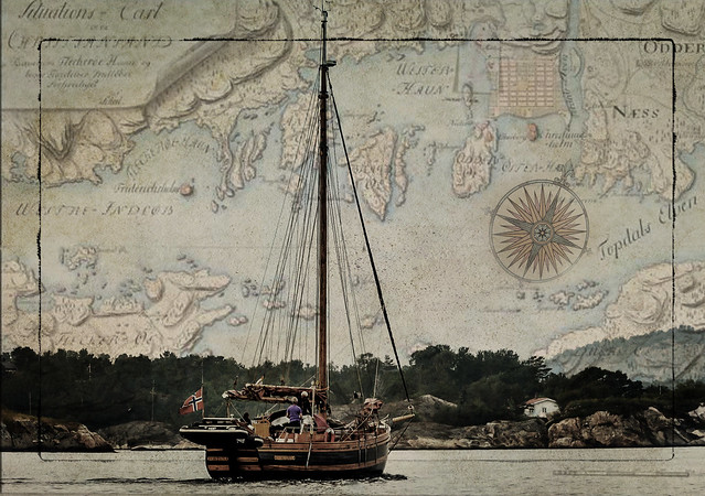
 I worked with this sailboat that I captured yesterday. I used an old map from an archive for common use from my hometown. Texture was a picture of rain on a windowpane. I would welcome constructive critique. |
|
|
|
Post by BuckSkin on Jul 6, 2015 23:34:17 GMT
What is to critique ?
That is an excellent idea that I wish I had thought of myself and very well executed.
I really like it !!!
Good job !!!  |
|
Deleted
Deleted Member
Posts: 0
|
Post by Deleted on Jul 7, 2015 4:11:37 GMT
I would welcome constructive critique. Hi Marianne, I like the concept/theme of combining the past and the present very much  Please take my comments as just my opinion and potential food for thought. From a technical view point, on my screen (calibrated) the image appears a little too dark. Looking at the image's histogram I see next to no pixels with rgb values above ~212. If you use a Levels adjustment layer and move each of the red, green and blue channels' white point slider close to where the values drop to about 0, it will result in a slightly brighter image with a fuller tonal range. The colour of the sea on the map should have a noticeably bluer shade, which for me looks better. Adjusting the shadows/highlights will also give a little more detail in the shadows (trees/rocks on the coastline) and the surface of the water the boat is floating on. From an artistic point of view I really like the blending of the past and present, as I said. But to my taste, I feel the boundary between the present (tree tops) and the past (map) is too harsh. One thing you could consider is some sort of transition at that boundary. Maybe something like blurring, or some other effect (maybe a gradient map), slightly above and below the horizon (where the tree tops etc and the map meet). I probably wouldn't blur, or whatever, the horizon between the boat's mast stays. Anyway, as I said earlier, this is just my opinion which might give you some food for thought  |
|
Madame
Established Forum Member
 
Posts: 504  Open to constructive criticism of photos: Yes
|
Post by Madame on Jul 7, 2015 7:56:13 GMT
Thank you both!  I'm glad you like it Buckskin! Fstop, I agree.. now that I see it again in the morning, it's too dark. I think it was the texture that was wrong, it was very dark. I tried with several settings (levels) and I couldn't find one that I was pleased with. Thank you for the suggestion for the gradient, I will go back and try some more.  As for the red tones, it was my intention to tone down the reds. It was a very grey day, so next to nothing blue in the sea and the sky. I appreciate your input very much. Food for thoughts.. yummy.. haha. As I said, I will play some more.  |
|
Madame
Established Forum Member
 
Posts: 504  Open to constructive criticism of photos: Yes
|
Post by Madame on Jul 7, 2015 13:37:26 GMT
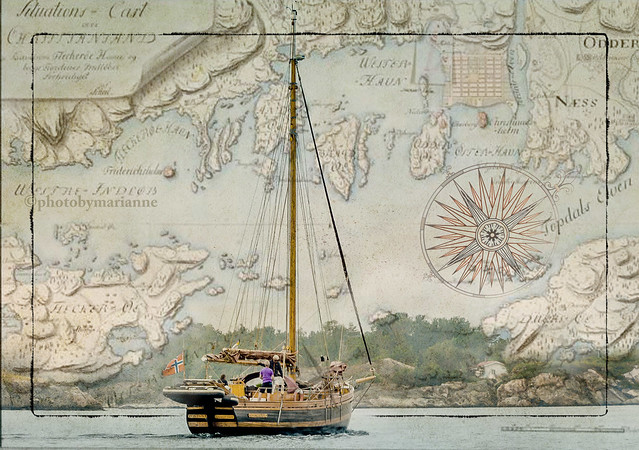
 I made some changes. I used another texture. I put the sailboat on the map not the other way around. I used some different blending modes so it appears lighter. I added just a hint of blue to the sea, and the blue on the map is more visible. I still toned down the red, -the boat was too orange. |
|
Berengaria
Established Forum Member
 
Posts: 398  Open to constructive criticism of photos: Yes
|
Post by Berengaria on Jul 7, 2015 14:09:18 GMT
 I made some changes. I used another texture. I put the sailboat on the map not the other way around. I used some different blending modes so it appears lighter. I added just a hint of blue to the sea, and the blue on the map is more visible. I still toned down the red, -the boat was too orange. I think you improved it a lot, although I liked the first attempt, too. It's a lovely picture and the effect is great. I think I'll save it. Bernie |
|
Madame
Established Forum Member
 
Posts: 504  Open to constructive criticism of photos: Yes
|
Post by Madame on Jul 7, 2015 14:16:52 GMT
Thank you, Bernie!  I'm more pleased with this. I have to thank you fstop, for pointing in the right direction. |
|
|
|
Post by BuckSkin on Jul 7, 2015 16:56:45 GMT
My vote still goes with the first edition; it just has more of an antique nautical feel to me. Nevertheless, I am impressed and will be keeping your antique map idea in mind for some of my own endeavors.  Alas, there is nothing much picturesque within hundreds of miles of where I live, except for about three days in the fall when the leaves turn to color right before torrential rains knock them all to the ground. Instead of beautiful sailing vessels, our lakes are almost completely covered with hideous-looking houseboats; picture a floating mobile-home, nothing anyone would want a picture of. |
|
Madame
Established Forum Member
 
Posts: 504  Open to constructive criticism of photos: Yes
|
Post by Madame on Jul 7, 2015 17:17:03 GMT
Thank you, BuckSkin!  It was the antique look I was looking for, but I think I go for the last one. What to take picture of? -Well, what's everyday life for one, can be very exotic for another.  |
|
Deleted
Deleted Member
Posts: 0
|
Post by Deleted on Jul 8, 2015 0:06:18 GMT
Hi Marianne. I like the 2nd one much better  It is brighter and the transition from past to present, as I described earlier, is now much easier on my eyes as they look up and down your photo. The map and foreground blend very well together now. When looking up and down your original photo the boundary between past and present was too sudden and harsh for me imo. |
|
Madame
Established Forum Member
 
Posts: 504  Open to constructive criticism of photos: Yes
|
Post by Madame on Jul 8, 2015 10:50:43 GMT
Thank you, fstop! I changed the order of the layers, and that made it easier to find the right expression. Thanks to your CC.  |
|
Deleted
Deleted Member
Posts: 0
|
Post by Deleted on Jul 8, 2015 22:17:58 GMT
No problem Madame. Happy to try to help  |
|
JimD
Junior Forum Member

Posts: 149  Open to constructive criticism of photos: Yes
|
Post by JimD on Jul 9, 2015 3:01:25 GMT
Great work, Marianne. I like the second, lighter version better also. If I really wanted to nit-pic I would mention that the black border seems a bit distracting to me. I personally would either remove it or place it around the entire scene - ship, water, and map - but that just reflects my own personal taste, and I am probably not appreciating the symbolism you want to portray here enough.
|
|
Madame
Established Forum Member
 
Posts: 504  Open to constructive criticism of photos: Yes
|
Post by Madame on Jul 9, 2015 7:30:53 GMT
Thank you, JIm. CC is about personal preferences. Who's preferences else should we express..  I think I'll keep the frame, though  |
|
|
|
Post by cats4jan on Jul 10, 2015 18:42:00 GMT
I like both, but have to admit - the first version "speaks" to me. Like has already been said, it sets a mood for me, too.
|
|