|
|
Post by maghdalena on Oct 26, 2016 5:10:05 GMT
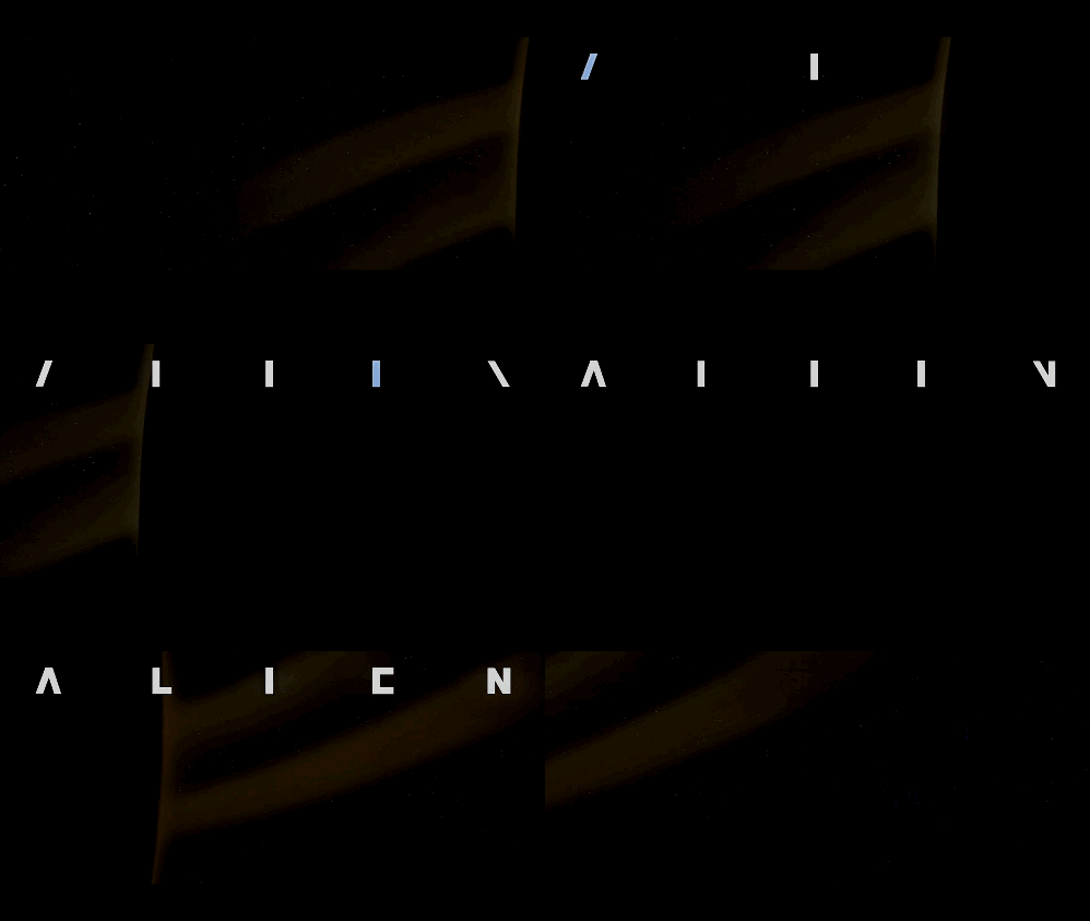
We'd like to do a homage to the movie intro to the movie "Alien". Same slow reveal and font, different word. The letters wouldn't be white. They'd be a different color. The background might be different, the music would have to be. Pretty clear on what, not so great on how. Here's a sample from "artofthetitle.com":
 Any suggestions?
|
|
|
|
Post by cats4jan on Oct 26, 2016 12:39:05 GMT
First layer will be a solid color, second layer the lines, third layer the text (however, you may want to keep each box's text on it's own layer)
First, turn on the grid - you'll find it the same place you found the rulers. View> Grid
The grid divisions can be adjusted by going to Preferences> Guides and Grid However, it is likely your divisions/spacing on the grid may work without changing.
There is a pencil to draw lines. Holding down the shift key while you draw allows you to draw a straight line.
You can also draw a straight line by clicking - once at the beginning point, once at the ending point
Realize, the rulers will also work for this, but take a look at the grid to see if you like that better.
Then work on your text. That will take some work and the right font, but I am sure you can do it.
|
|
mrkrnbrd
Junior Forum Member
 Alive
Alive
Posts: 94  Open to constructive criticism of photos: Yes
|
Post by mrkrnbrd on Oct 26, 2016 14:06:38 GMT
Hi maghdalena , When you come to do the text you could always cover up the bits of the font with boxes the same colour as the background which you then take away as you animate - this might be easier than drawing the font from scratch using lines Mark  |
|
|
|
Post by maghdalena on Oct 27, 2016 4:56:36 GMT
What program do you use to animate? And how do you do that? It's something to think about and it looks real cool! Also, wouldn't it be easier to start with the title, then animate and covering with the boxes, and whatever? Not to tell you your business, of course. You guys and gals have a lot more experience than I do at this point. Hi maghdalena , When you come to do the text you could always cover up the bits of the font with boxes the same colour as the background which you then take away as you animate - this might be easier than drawing the font from scratch using lines Mark  |
|
|
|
Post by maghdalena on Oct 27, 2016 5:09:33 GMT
Thanks for your prompt reply, first, Jan. My husband wanted to ask wouldn't it be simpler to do this in reverse, that is the title, then then strip it down? (once I get the first layer in of course? What do you think? First layer will be a solid color, second layer the lines, third layer the text (however, you may want to keep each box's text on it's own layer) First, turn on the grid - you'll find it the same place you found the rulers. View> Grid
The grid divisions can be adjusted by going to Preferences> Guides and Grid However, it is likely your divisions/spacing on the grid may work without changing. There is a pencil to draw lines. Holding down the shift key while you draw allows you to draw a straight line. You can also draw a straight line by clicking - once at the beginning point, once at the ending pointRealize, the rulers will also work for this, but take a look at the grid to see if you like that better. Then work on your text. That will take some work and the right font, but I am sure you can do it. |
|
|
|
Post by cats4jan on Oct 27, 2016 11:27:47 GMT
If where you stripe is up for grabs, you can wait to stripe. But if you want symmetry and fixed sizes, eyeballing where to put the text will be difficult without having borders for each text box. Of course, this is all a learning experience, so try it both ways. If, after doing your grid, you find it distracting, the grid layer can be shut off. Personally, I could not do it text first, then grid, that's why I suggested doing grid first.
|
|
|
|
Post by maghdalena on Oct 28, 2016 5:28:28 GMT
Jan, I misunderstood your directions earlier. I'll try it your way, OK. It sounds sensible. I don't actually know how to do any of these steps. The only layer I know how to do was the first layer, the background layer, after that, I'm totally lost. If where you stripe is up for grabs, you can wait to stripe. But if you want symmetry and fixed sizes, eyeballing where to put the text will be difficult without having borders for each text box. Of course, this is all a learning experience, so try it both ways. If, after doing your grid, you find it distracting, the grid layer can be shut off. Personally, I could not do it text first, then grid, that's why I suggested doing grid first. |
|
|
|
Post by cats4jan on Oct 28, 2016 10:11:40 GMT
When you turn on the grid, the lines will be a schematic for where to draw your lines. Grab the pencil tool and choose a grid line - hold down the shift key - click on one of the grid lines, while holding down the left mouse button and drag your line. Holding down the shift key allows for a straight line. If you do not hold down the shift key, you get a free hand line.
Drawing the template first gives you parameters for each text box.
The only way to learn is to try all sorts of things and see what happens. There are many ways to accomplish a task. None of them is bad. We all have our favorite ways. We learn them accidentally or by reading tutorials or hints from fellow users.
You are approaching learning by trying projects. I think that is the best way to learn. It's all about trial and error. You see how things work and you develop your own favorite ways of doing things.
My best advice is always keep things on their own layers. Many times during a project, you decide to go in a different direction. If each step is on it's own layer, you simply erase your layer and try it another way.
I learned PSE using a book called "Digital Scrapbooking in Easy Steps". It was filled with simple projects and while you completed the projects, you were learning how the tools worked. Up until then, I was baffled. Your approach- doing projects - is the best way to learn.
You'll get there. It's just that this software is not intuitive. It's based on a graphic design program for pros. It's inherently difficult, but well worth the learning curve.
|
|
mrkrnbrd
Junior Forum Member
 Alive
Alive
Posts: 94  Open to constructive criticism of photos: Yes
|
Post by mrkrnbrd on Oct 28, 2016 14:29:18 GMT
Hi Maghdalena, It is possible to use Photoshop Elements to animate pictures, you need to save them as a 'GIF' file format using the save for web dialog. Each layer then becomes a frame in the animation:   What program do you use to animate? And how do you do that? It's something to think about and it looks real cool! Also, wouldn't it be easier to start with the title, then animate and covering with the boxes, and whatever? Not to tell you your business, of course. You guys and gals have a lot more experience than I do at this point. Hi maghdalena , When you come to do the text you could always cover up the bits of the font with boxes the same colour as the background which you then take away as you animate - this might be easier than drawing the font from scratch using lines Mark  |
|
|
|
Post by maghdalena on Nov 15, 2016 6:37:34 GMT
Jan, I'll give the grid a shot. I did actually get a copy of Digital Scrapbooking in Easy Steps, and I have a copy of Photoshop CS2 in Easy Steps, as we have a copy of that program. It's pretty old though. The name we want to put on for the "Alien Homage" is actually 'Algol" Will the "G" make it harder? Projects give me practical experience, so you're definitely right there. One of the projects I'd like to do, not related to this one is a "Vision Board", so that scrapbooking book will actually be pretty helpful. I'm looking through it. Just wanted to touch base. I'll try to remember what you said too about not being judgmental about the different ways to do a project. Again, thanks for the recommendation on that book. (I got it used). Thanks again. When you turn on the grid, the lines will be a schematic for where to draw your lines. Grab the pencil tool and choose a grid line - hold down the shift key - click on one of the grid lines, while holding down the left mouse button and drag your line. Holding down the shift key allows for a straight line. If you do not hold down the shift key, you get a free hand line. Drawing the template first gives you parameters for each text box. The only way to learn is to try all sorts of things and see what happens. There are many ways to accomplish a task. None of them is bad. We all have our favorite ways. We learn them accidentally or by reading tutorials or hints from fellow users. You are approaching learning by trying projects. I think that is the best way to learn. It's all about trial and error. You see how things work and you develop your own favorite ways of doing things. My best advice is always keep things on their own layers. Many times during a project, you decide to go in a different direction. If each step is on it's own layer, you simply erase your layer and try it another way. I learned PSE using a book called "Digital Scrapbooking in Easy Steps". It was filled with simple projects and while you completed the projects, you were learning how the tools worked. Up until then, I was baffled. Your approach- doing projects - is the best way to learn. You'll get there. It's just that this software is not intuitive. It's based on a graphic design program for pros. It's inherently difficult, but well worth the learning curve. |
|
|
|
Post by cats4jan on Nov 15, 2016 9:37:07 GMT
Interesting that you were able to get your hands on that book. I don't think it's being published anymore. It's old, but the basics and ideas work with all versions of PSE. I liked it because it was so basic and when I found it, I had given up hope that I'd ever learn PSE. I'm not sure why I wasn't googling my questions, but since it was almost 10 years ago, I'm sure my use of the Internet was different. I happened upon sites like this because of the book, though. So my finding that book was fortuitous in more ways than one.
As for the letter G, if you use capitals, no part of the letter will fall below your text line.
|
|