|
|
Post by Lillias on May 14, 2019 22:07:15 GMT
Image from kisspng.
 |
|
|
|
Post by hmca on May 14, 2019 22:40:13 GMT
Perfect pairing or paring  |
|
|
|
Post by cats4jan on May 14, 2019 23:54:52 GMT
That's clever
|
|
|
|
Post by Bailey on May 15, 2019 1:05:54 GMT
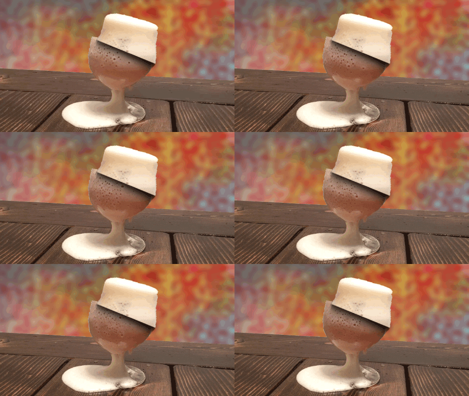
Yes, very clever indeed........can you share how you "sliced" the text?
|
|
|
|
Post by Lillias on May 15, 2019 8:44:06 GMT
can you share how you "sliced" the text? No problem Bailey. I followed this YouTube video tutorial. It was done in PS but can be done the exact same way in PSE. It was just a bit of fun. There are other ways of doing this but this way is non-destructive which I liked. www.youtube.com/watch?v=Ng4fInM82Wk |
|
|
|
Post by Bailey on May 15, 2019 12:40:25 GMT
Thank you BillieJean.
I will definitely have a look at it and try it.
TFS
|
|
|
|
Post by kdcintx on May 15, 2019 21:46:42 GMT
Very interesting effect. Thanks for sharing. Always learning new things on PSE&More.
|
|
|
|
Post by cats4jan on May 16, 2019 12:31:35 GMT
A simple, but very effective, technique. TFS
|
|
|
|
Post by Lillias on May 16, 2019 12:47:42 GMT
Please feel free ANYONE willing to try this and show us what you did with the tutorial.
|
|
|
|
Post by blackmutt on May 17, 2019 1:12:23 GMT
|
|
|
|
Post by Lillias on May 17, 2019 9:16:13 GMT
Thanks for joining in the fun blackmutt...
|
|
|
|
Post by Bailey on May 18, 2019 6:41:25 GMT
Hi again BillieJean,
I finally had a chance to watch the tutorial. Thanks for sharing. I was pleasantly surprised at how easy it is.
But the only thing messing with my eyes and brain when I look at your and Blackmutt's image is that the sliced text is offset a little but the rest of the image above or below the slice/cut is not. It doesn't look totally natural to me.
I will have to have a play with this technique to see if I can also offset the rest of the image on either side of the cut by the same amount of the text offset.
|
|
|
|
Post by cats4jan on May 18, 2019 11:15:31 GMT
Bailey - I believe offsetting is what makes it look so good. However, not everyone likes things to look the same way, that’s why one takes a tutorial and makes it his own. Looking forward to seeing your version.
|
|
|
|
Post by Lillias on May 18, 2019 13:08:29 GMT
Bailey I believe the text is offset in order to emphasize that it is sliced. It is offset in the tutorial too. I can’t say it looks odd to me but that could be because I’m not understanding exactly what you mean. I’m wondering if you mean the background should also be sliced like this… if not,then I'm at a loss to know what doesn't look right to you.  |
|
|
|
Post by ritage on May 18, 2019 15:54:41 GMT
This works better with text, but I tried for some extra fun 

|
|