|
|
Post by Lillias on Apr 12, 2016 10:44:55 GMT
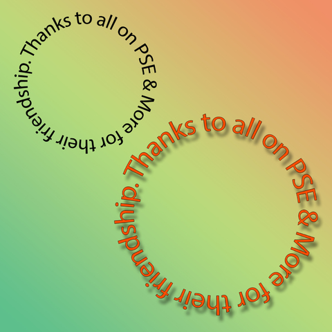
I came across this tutorial the other day and thought it might be of interest to some. It is an old tutorial having been created in 2011 but it still pertains today. The only thing I'd say is that using this method in PSE means that the text becomes un-editable but it can still be re-sized and have effects applied to it when selected and if you are looking for a quick way to create text on a circle – this is it.  |
|
|
|
Post by hmca on Apr 12, 2016 12:19:57 GMT
What a great tip, BillieJean!
|
|
Squirrel2014
Established Forum Member
  Where's that cup of tea ... ???
Posts: 685  Open to constructive criticism of photos: Yes
|
Post by Squirrel2014 on Apr 12, 2016 19:15:31 GMT
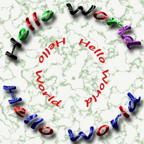
Thanks for sharing this link, BillieJean I had a play-around, not particularly imaginatively, I have to say. However, the marble background is one I created recently, having followed a tutorial from somewhere on the internet not that long ago. In this tutorial, in the comments, someone asked if the text in the lower half of the circle could be the right way up for reading and the answer was 'No, not in Elements' which got me thinking, just a little bit. As you can see, I've proved that answer to be wrong. All I did was to write the text in two halves (in this case rather easy  ) It was on a separate layer, of course, so I then merged the two layers before using the Polorize filter. Needless to say, placement needs to be in the right place but, using Ctrl+Z, it's not that onerous to experiment Another tip I would like to mention is regarding finding the centre of the canvas. In the tutorial it suggests using the Grid but I found it easier to use a slight variation of the method that was suggested, in the Triptychs thread, using the Crop Tool and the Rule of Thirds although, in this case, I didn't use the Rule of Thirds. Using the Crop Tool, I selected the whole canvas, then the centre had a dot in the centre while the Crop Tool was active. I then pulled out a Guide Line from the side and the top ruler and placed on this marked centre points. I then removed the Crop Tool selection and went on to type from the middle etc. Also, I found I was able to change the colour of the text by using the Paint Bucket Tool and clicking on each individual letter. I haven't investigated if it's possible to change the font style but I suspect not. I didn't even think of Happy Birthday text until now  Doh  |
|
|
|
Post by Lillias on Apr 12, 2016 20:24:16 GMT
Well you've been busy Julie to great effect I have to say. As I mentioned in my original post, using this method means that the text cannot be edited as the text layer had to be simplified so it does have its limitations in that regard. That being said you can colour it and put effects on the text. Here is a good video tut on 'Text on a Circular Path with Photoshop Elements' and in that tut he shows how to put text in the lower half of the circle showing the right way up. Using his method the text remains fully editable. www.youtube.com/watch?list=UUl7CwTNw69LtWLPEWPc_EJg&v=Wmh5ki5FY2U |
|
|
|
Post by Sepiana on Apr 12, 2016 20:31:22 GMT
Another tip I would like to mention is regarding finding the centre of the canvas. In the tutorial it suggests using the Grid but I found it easier to use a slight variation of the method that was suggested, in the Triptychs thread, using the Crop Tool and the Rule of Thirds although, in this case, I didn't use the Rule of Thirds. Using the Crop Tool, I selected the whole canvas, then the centre had a dot in the centre while the Crop Tool was active. I then pulled out a Guide Line from the side and the top ruler and placed on this marked centre points. I then removed the Crop Tool selection and went on to type from the middle etc. There are more alternatives to find the center of the canvas/image in this thread.
www.photoshopelementsandmore.com/thread/1531/make-circular-selection
|
|
|
|
Post by Lillias on Apr 12, 2016 21:08:39 GMT
This is a great video. Thanks! You are welcome. |
|
Squirrel2014
Established Forum Member
  Where's that cup of tea ... ???
Posts: 685  Open to constructive criticism of photos: Yes
|
Post by Squirrel2014 on Apr 12, 2016 21:32:05 GMT
Thanks to all of you regarding links to video and the variety of ways to find the centre point. This has all been so very useful  |
|
|
|
Post by Sydney on Apr 12, 2016 23:23:17 GMT
Awesome - thanks BillieJean!
|
|
|
|
Post by cats4jan on Apr 14, 2016 19:33:59 GMT
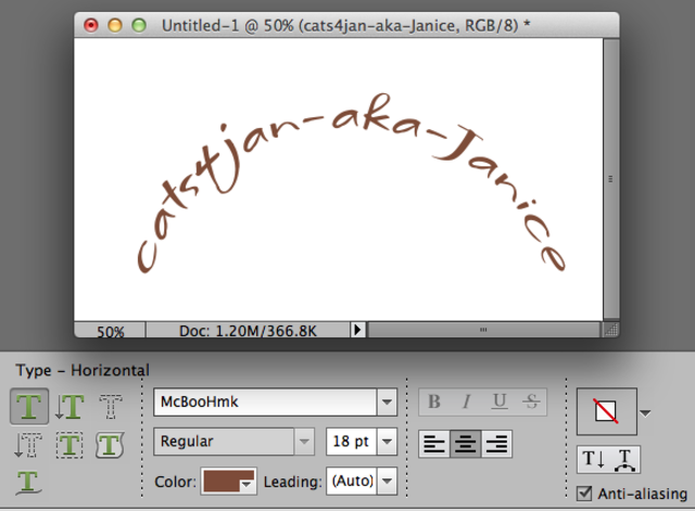
BillieJean - now you've got me going on text again LOL PSE11 Another way to go - you can use the Warp option of the Text tool if you want a half circle Warp is on the right bottom edge of the text tool options - --it's the T with the half circle with three dots under it - there are many other options under Warp To use warp, highlight your text and click on the Warp Icon - choose your 'style' and adjust the horizontal and vertical sliders. You do not need to rasterize/simplify the text because you are working within the text tool options.  |
|
|
|
Post by Sepiana on Apr 14, 2016 20:59:34 GMT
Just adding some clarification.
If you want to turn off the "Show Asian Text Options", don't just go back to Edit>Preferences>Type to do it. First, make sure to change the percentage back to zero in the Type Tool Options bar. If you don't do this, next time you use the Type tool, your text will still display the spacing adjustment you had made earlier.
I believe the other option -- Tate-Chuu-Yoko -- will be available when you use the Vertical Type Tool.
|
|
|
|
Post by cats4jan on Apr 14, 2016 21:11:04 GMT
Note - I deleted my post about Asian Text options. I think it may cause more trouble than help.
|
|
|
|
Post by Sepiana on Apr 14, 2016 21:27:35 GMT
Janice,
You shouldn't have. Your post contained very valuable information for Elements users, particularly for new users of this program. You can change the space between letters in Photoshop but not in Elements. So, using the "Show Asian Text Options" is the best workaround. It doesn't offer the flexibility of Photoshop but it does offer a reasonable level of adjustability. As a matter of fact, this workaround is the "official" one in the Help file.
|
|
|
|
Post by Lillias on Apr 14, 2016 21:46:37 GMT
I believe the other option -- Tate-Chuu-Yoko -- will be available when you use the Vertical Type Tool. That's correct Sepiana I just tested that. Note - I deleted my post about Asian Text options. I think it may cause more trouble than help. Please reconsider and post it again Janice. I found it helpful. Janice, You shouldn't have. Your post contained very valuable information for Elements users, particularly for new users of this program. You can change the space between letters (kerning) in Photoshop but not in Elements. So, using the "Show Asian Text Options" is the best workaround. It doesn't offer the flexibility of Photoshop but it does offer a reasonable level of adjustability. As a matter of fact, this workaround is the "official" one in the Help file. I totally agree with Sepiana. |
|
|
|
Post by cats4jan on Apr 14, 2016 22:06:51 GMT
To clarify why I deleted my post - when Sepiana mentioned how if we forget to adjust the kerning back and/or forget we changed it in the first place, I envisioned a reoccurring problem with text. I didn't think the benefit of using that technique was worth potential future grief, especially when one could use the move tool to push the letters closer together with no potential lingering text problems. I know how I work - and I know how I forget - LOL. Was afraid I'd get someone in hot water. Not to say we shouldn't explore the different functions of PSE - but it just seemed potential grief outweighed the usefulness of that option. I'm guessing that's why PSE has a preference setting to turn off that function. _______________________________________________ And now we have everyone curious about what we are talking about.  "Asian text" is a function of the text tool used to adjust kerning. You need to turn the function on through PSE Preferences before it will show up as an option of your text tool.  |
|
|
|
Post by cats4jan on Apr 14, 2016 22:31:02 GMT
And now that the discussion is back on the board, I tried using the move tool and asian text to see the difference in the results - well, it's apparent in this example. Not the same result at all
 |
|