|
|
Post by Tpgettys on May 25, 2015 22:47:48 GMT
I couldn't get the merge visible to work the way the tutorial suggested (it merged all the layers into a background layer) but found a work around. That titbit about the gradiant tool is cool, and I can see that coming in handy. If I can only remember it! Not sure it looks painterly - looks more blurry. The way I do the merge visible is to select the top layer, then Ctrl-Shift-Alt-E (it's quite a handful!). Hard to say without the original, but it does look painterly to my eye, but that is where experimenting with a different filter might give a result more pleasing to you. One aspect of this effect that I liked was that it was pretty easy to play with. Thanks Tom ... it was an interesting tut. Here's a Chevy I shot this morning. Bill Interesting result Bill; the car looks almost hyper-real, and the background looks like a wall mural; I find it compelling. |
|
|
|
Post by blackmutt on May 25, 2015 23:30:05 GMT
That is exactly what I did. A maneuver similar to patting your head and rubbing your stomach at the same time!! Thank you!
|
|
|
|
Post by Tpgettys on May 26, 2015 1:54:16 GMT
A terrific challenge! You guys produced some great results.
I slightly deviated from the tutorial by using the cutout filter rather than the dry brush as I felt it was more effective with the image I was using. In addition I didn't add a texture. Thanks for giving it a try Sydney! I especially like how it affected the plate displays. Now that you have successfully implemented this tut, I hope you will be encouraged to have some more fun and try extending it. |
|
Madame
Established Forum Member
 
Posts: 504  Open to constructive criticism of photos: Yes
|
Post by Madame on May 26, 2015 7:51:54 GMT
Thanks for the good words on my picture. I love the outcome on every picture on the thread.
It shows the diversity of the technique!
I find "the stamp visible" is easier to remember if think "CASE": cmd, alt, shift E... maybe it's just me.. haha.
|
|
Bayla
Established Forum Member
 
Posts: 555
|
Post by Bayla on May 26, 2015 13:34:12 GMT
Here's mine. Didn't care for the Plastic Wrap effect so used Palette Knife instead.  The thing I really liked about this tutorial was the painting areas to make them lighter using the gradient tool. Never done that before. Thanks Tom for finding this tutorial  Bayla |
|
|
|
Post by Sepiana on May 27, 2015 2:01:49 GMT
Sepiana that is beautiful. Great results. Judy, thanks! Pleased with your feedback. |
|
|
|
Post by Sepiana on May 27, 2015 2:10:31 GMT
Does John's Impasto work on PS Elements? I love that effect. Berie Berie,
Yes, it does. This texture is a PSD file. I don't remember where I got this texture (a freebie). If you are interested in this effect, here is his website.
expressivepixels.com/johnsimpasto/index.html
|
|
Deleted
Deleted Member
Posts: 0
|
Post by Deleted on May 27, 2015 7:10:56 GMT
Thanks for finding the link Sepiana, that is the one i found earlier when i told Berie it should work. But i could not find it again.
|
|
verber10
Junior Forum Member
 Best wide-angle lens? Two steps backward. Look for the 'ah-ha'. The Mitten State
Posts: 204 
|
Post by verber10 on May 28, 2015 12:23:57 GMT
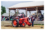
Thanks Tom for this weeks CF Challenge. I followed the tutorial, and didn't make any changes. Good job everyone. They all look great. Mine is from a tractor pull.  |
|
|
|
Post by Tpgettys on May 29, 2015 19:15:03 GMT
Here's mine. Didn't care for the Plastic Wrap effect so used Palette Knife instead. The thing I really liked about this tutorial was the painting areas to make them lighter using the gradient tool. Never done that before. Thanks Tom for finding this tutorial  Bayla Nicely done Bayla! That use of the gradient tool was new to me as well, and seems like it will be useful. Thanks Tom for this weeks CF Challenge. I followed the tutorial, and didn't make any changes. Good job everyone. They all look great. Mine is from a tractor pull. Really nice watercolor image verber10! You really found the perfect subject for this effect. |
|
verber10
Junior Forum Member
 Best wide-angle lens? Two steps backward. Look for the 'ah-ha'. The Mitten State
Posts: 204 
|
Post by verber10 on May 30, 2015 12:22:27 GMT
Thanks Tom for the nice comment. Glad you liked it.  |
|
Joe (JEGavlas)
New Forum Member
Posts: 45
Open to constructive criticism of photos: Yes
|
Post by Joe (JEGavlas) on May 30, 2015 23:45:41 GMT
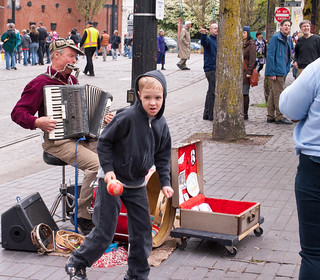
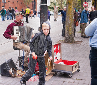
Better contribute to the new site. I did some earlier testing but seem to have forgot everything I learned. Sure do miss the preview function that was available on the old site. I gotta get better pictures to apply this technique to. Not sure I like what the cellophane does to the images especially the boys face. Before  After  |
|
Bayla
Established Forum Member
 
Posts: 555
|
Post by Bayla on May 31, 2015 11:22:32 GMT
Sure do miss the preview function that was available on the old site. Not sure what you mean Joe. There is a preview button here, bottom left of the box you write a reply in with the BBCode tab next to it. Only thing is that for some reason, once you've added your picture you have to click on the BBCode tab and then click back on the Preview tab for your images to show. Bayla |
|
Joe (JEGavlas)
New Forum Member
Posts: 45
Open to constructive criticism of photos: Yes
|
Post by Joe (JEGavlas) on May 31, 2015 14:33:38 GMT
The only time I've see the preview is when I go to edit it. I'm posting images from Flickr.
|
|
Bayla
Established Forum Member
 
Posts: 555
|
Post by Bayla on May 31, 2015 15:09:13 GMT
And you have to click on the Reply button, not the Quick Reply.
Bayla
|
|