alexr
Established Forum Member
 
Posts: 555
Open to constructive criticism of photos: Yes
|
Post by alexr on Feb 3, 2019 13:17:44 GMT
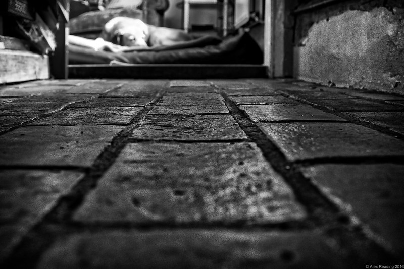
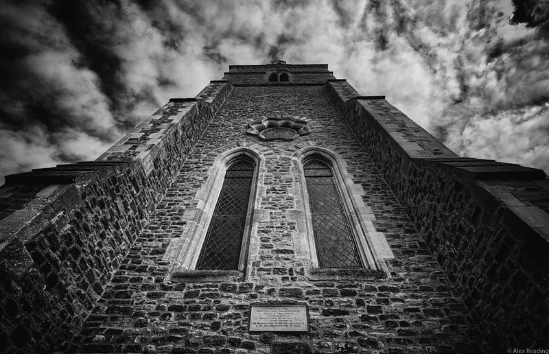
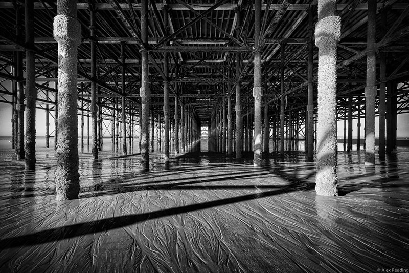
Thanks for all of the great entries 'Looking Through'. For this month's challenge I was thinking about what it is that makes me think that an image might look better in mono than colour. And for me this is mostly about texture. I find that the absence of colour allows you to find greater interest in the textures in an image. So for this month please look for images where either the main subject is the texture, or where texture forms a significant part of the image. A couple of (not great) examples of mine to get you thinking: Although you'd think the main focus of the image would be the sleeping dog, I just loved the old floor: 
Mono hallway by AlexR!, on Flickr Trying to show a contrast between brick texture and cloud: 
Christ Church dramatic tower by AlexR!, on Flickr For me this image was all about the lines in the sand and the barnacled structure: 
Under South Pier mono by AlexR!, on Flickr Good luck and I look forward to seeing your own interesting interpretations. I will be trying to get out and about myself. |
|
|
|
Post by hmca on Feb 3, 2019 15:46:29 GMT
Great theme. this ought to be fun, Alex!
|
|
|
|
Post by blackmutt on Feb 4, 2019 0:17:32 GMT
|
|
|
|
Post by tonyw on Feb 4, 2019 2:09:41 GMT
I always find the bark of the American Sycamore to be fascinating - and it looks good in black and white. Could be a map but it's just bark.  Tony |
|
billz
Senior Forum Member
  
Posts: 827
|
Post by billz on Feb 7, 2019 5:42:20 GMT
Trolley tracks. (Not in use during winter months.)  Thanks for the challenge Alex! |
|
|
|
Post by Bailey on Feb 7, 2019 6:27:29 GMT
Interesting theme Alex  I took this photo of one of the many amazing rock carvings at Lingyin Temple, West Lake, Hangzhou, China in 2014. I converted to B&W using the B&W Adjustment Layer in Elements+ and then tweaked it in PSE using a Levels and a Brightness/Contrast Adjustment Layer to maximise the tonal range and depth. |
|
alexr
Established Forum Member
 
Posts: 555
Open to constructive criticism of photos: Yes
|
Post by alexr on Feb 8, 2019 19:04:17 GMT
blackmutt, thanks for getting us off to a great start. I love the textures in old peeling paint (except when it is on one of my own doors!) and you have caught this really well. And I love where you've placed the structure of the door - nicely offset from centre and providing intrigue into the very black shadow area.
tonyw, that looks remarkably similar to the iconic (to me anyway) London Plane tree. I love its peeling bark and have tried many a time to capture it well, but never really succeeded. And you know, thinking back, I don't think I've ever converted to mono. So you've stirred my soul, thanks for that. And I agree it looks like a map. And I'm a cartographer so I should know...
billz, what a great set of varied texture. The smooth rail, leading the eye into the image, the stone ballast and unkempt leaves, and then the wooden, somewhat distressed, sleepers. And all this leads to a gleaming white point of interest in the gate, providing a counterpoint of regular geometry.
Bailey, I like the unusual perspective, it sort of sets me on edge because I expect this image to be taken straight on with the sitting figure more central and the creature walking 'into' the frame. But it isn't which leads to a more dynamic image, and like billz, a wealth of different textures but this time all manmade or consciously selected by the designer. It feels so tactile yet is clearly out of reach.
|
|
|
|
Post by tonyw on Feb 8, 2019 21:25:05 GMT
blackmutt, thanks for getting us off to a great start. I love the textures in old peeling paint (except when it is on one of my own doors!) and you have caught this really well. And I love where you've placed the structure of the door - nicely offset from centre and providing intrigue into the very black shadow area. tonyw, that looks remarkably similar to the iconic (to me anyway) London Plane tree. I love its peeling bark and have tried many a time to capture it well, but never really succeeded. And you know, thinking back, I don't think I've ever converted to mono. So you've stirred my soul, thanks for that. And I agree it looks like a map. And I'm a cartographer so I should know... billz, what a great set of varied texture. The smooth rail, leading the eye into the image, the stone ballast and unkempt leaves, and then the wooden, somewhat distressed, sleepers. And all this leads to a gleaming white point of interest in the gate, providing a counterpoint of regular geometry. Bailey, I like the unusual perspective, it sort of sets me on edge because I expect this image to be taken straight on with the sitting figure more central and the creature walking 'into' the frame. But it isn't which leads to a more dynamic image, and like billz, a wealth of different textures but this time all manmade or consciously selected by the designer. It feels so tactile yet is clearly out of reach. You are right about the London Plane being very similar to the American Sycamore - they are closely related. The London Plane is a cross between the American Sycamore and the Oriental Sycamore - which happened in the UK around 1700 after seeds of both were imported from the Americas and the Orient. Not always easy to tell them apart and you can find both here - but I think this one was one of the native ones. Tony |
|
|
|
Post by blackmutt on Feb 8, 2019 23:51:51 GMT
Thank you. The door is a wonderful green that I found on a side street in a small town in Wisconsin. Love this door
|
|
|
|
Post by Peterj on Feb 9, 2019 0:34:32 GMT
Here's a Civil War Split Rail Fence  |
|
|
|
Post by Peterj on Feb 9, 2019 1:55:48 GMT
HooDoo  |
|
|
|
Post by Bailey on Feb 9, 2019 2:01:17 GMT
... Bailey, I like the unusual perspective, it sort of sets me on edge because I expect this image to be taken straight on with the sitting figure more central and the creature walking 'into' the frame. But it isn't which leads to a more dynamic image, and like billz, a wealth of different textures but this time all manmade or consciously selected by the designer. It feels so tactile yet is clearly out of reach. Thank you Alex. If I have time I normally take photos of the subject from different angles and focal lengths to see if I can come up with something other than what most people would. |
|
bobharron
Junior Forum Member

Posts: 131  Open to constructive criticism of photos: Yes
|
Post by bobharron on Feb 9, 2019 16:56:38 GMT
|
|
billz
Senior Forum Member
  
Posts: 827
|
Post by billz on Feb 13, 2019 19:36:42 GMT
Thanks for the thoughtful comment Alex. I figured as long as the tracks were inactive I'd put them to some use.
I'm enjoying everyone's interpretations.
|
|
alexr
Established Forum Member
 
Posts: 555
Open to constructive criticism of photos: Yes
|
Post by alexr on Feb 13, 2019 19:54:51 GMT
Peterj, thanks for two great entries. The first in particular is a great demonstration of both texture and lighting. Really love the geometric shapes created, yet still natural and imperfect materials. It's another really tactile image, I just want to run my hand over the wood and feel the history of it. And then a great rock formation, contrasted against the sky, clouds and vegetation. And again, really well lit - it feels like the sunlight could have been really harsh but it is beautifully controlled.
bobharron, lovely vegetation texture, and with an interesting pattern of space woven into the centre. I think by being in mono, the sedum and the earth are integrated together, in colour it would have shown the contrast between the two, if that makes sense.
And, like billz, I am enjoying what you are all thinking of and creating; keep 'em coming.
|
|