Creative Effects Challenge No. 4 - Split-Toning
Jun 20, 2015 4:40:55 GMT
verber10 and Sydney like this
Post by Deleted on Jun 20, 2015 4:40:55 GMT
It is Friday night here and I am posting this a little early, as I will be out all day Saturday photographing in the Rockies. However, as it is Saturday somewhere on this planet already I figure I am right on time!
Can you believe it has been two weeks since our last CE Challenge? Thanks to Mike (verber10) for hosting it!
This week I want to show you a really great way to create split-toning. I have only ever done split-toning in LR, so this was a great learning opportunity for me and I must say, I actually prefer the result I got to the previous attempt.
I am using PSE13, so if you are using an older version, some of the locations of buttons etc may be slightly different.
My starter image is this photo of a staircase I took on my recent trip to Germany. Whilst the photo in itself is great, it does look a little boring.

After going through the steps listed below, my final image looks like this:

Step 1
Open your image in PSE and make sure your Foreground and Background colours are set to the default black and white. To do this kit “D” on your keyboard. Now you need to check that you have a full tonal range in your photo. Do this by clicking on the Adjustment Layer icon and selecting Levels from the list that pops up. You should now see your levels histogram; make sure that there are no gaps on either end of the graph. If there are gaps, slide the shadows and highlights sliders inwards so that they meet the edges.
Step 2
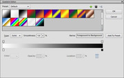
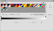
Click once more on the Adjustment Layer icon and this time pick the Gradient Map form the pop up list. A palette with a gradient strip will pop up; click on that strip and up pops the Gradient Editor. In here you will find the gradient presets; pick the first one, which should be the Foreground to Background preset. You should see your image being converted to black and white. In the Gradient Editor you will have a strip of black leading into white; above and below it are some small boxes; these are Stops. The Stops above the strip are the opacity stops, which we will ignore for this challenge. The ones you are interested in are the ones below the strip, the colour stops.
Step 3
The left stop is the Black Colour Stop; click on it and slide it inwards until the Location box reads 4%. As with all of our challenges, the numbers given are guidelines, the final position here really depends on your starter photo and your own taste. So, with this sat at 4% it will deepen the shadows in your photo. This slider movement will have also created a smaller slider about midpoint between the two bigger sliders. Now move this midpoint slider to around 46%, this will lighten the greys in your photo.
Step 4
Time to add some colour back into your photo. Click under the strip, between your Black Colour Stop and your midpoint slider to create a new stop. Move this new colour stop to around 25% and then click on the colour box located in the lower left part of the Gradient Editor, this will open your Colour Picker. Select a dark colour that works for you and the photo and see your photo being transformed. I used a dark blue for my photo. Once you are happy with your choice click ok and close the Colour Picker.
Step 5
Now you need to pick a lighter colour to complement your dark colour. You should still have your Gradient Editor open; so create another new colour stop, still underneath the strip, but in the lighter area. Set the location to around 75% and then open up the Colour Picker again to select your light colour. In my case I used a softer yellow. Once you are happy with your colour choice click ok and close the Colour Picker.
Step 6
Some fine tuning may now be required. In the Gradient Editor, which should still be open, you can adjust the position of your dark and light colours by moving their respective Stops. So, if you are not quite satisfied with your current result, move them around a little to see if you can settle on something more pleasing to your eye. Thankfully the changes happen almost in real time, as the changes are applied to your photo the minute you release the mouse button. Once you are happy you can even save this colour split in the Gradient Editor. Now in PSE 13 all I had to do was give it a name other than “Custom” and then hit the button that said “Add to Preset”.
So, I hope you have some fun creating your split-toning images and share them here with us all. If you alter any steps, or add any please also share these with us.
Can you believe it has been two weeks since our last CE Challenge? Thanks to Mike (verber10) for hosting it!
This week I want to show you a really great way to create split-toning. I have only ever done split-toning in LR, so this was a great learning opportunity for me and I must say, I actually prefer the result I got to the previous attempt.
I am using PSE13, so if you are using an older version, some of the locations of buttons etc may be slightly different.
My starter image is this photo of a staircase I took on my recent trip to Germany. Whilst the photo in itself is great, it does look a little boring.

After going through the steps listed below, my final image looks like this:

Step 1
Open your image in PSE and make sure your Foreground and Background colours are set to the default black and white. To do this kit “D” on your keyboard. Now you need to check that you have a full tonal range in your photo. Do this by clicking on the Adjustment Layer icon and selecting Levels from the list that pops up. You should now see your levels histogram; make sure that there are no gaps on either end of the graph. If there are gaps, slide the shadows and highlights sliders inwards so that they meet the edges.
Step 2
Click once more on the Adjustment Layer icon and this time pick the Gradient Map form the pop up list. A palette with a gradient strip will pop up; click on that strip and up pops the Gradient Editor. In here you will find the gradient presets; pick the first one, which should be the Foreground to Background preset. You should see your image being converted to black and white. In the Gradient Editor you will have a strip of black leading into white; above and below it are some small boxes; these are Stops. The Stops above the strip are the opacity stops, which we will ignore for this challenge. The ones you are interested in are the ones below the strip, the colour stops.
Step 3
The left stop is the Black Colour Stop; click on it and slide it inwards until the Location box reads 4%. As with all of our challenges, the numbers given are guidelines, the final position here really depends on your starter photo and your own taste. So, with this sat at 4% it will deepen the shadows in your photo. This slider movement will have also created a smaller slider about midpoint between the two bigger sliders. Now move this midpoint slider to around 46%, this will lighten the greys in your photo.
Step 4
Time to add some colour back into your photo. Click under the strip, between your Black Colour Stop and your midpoint slider to create a new stop. Move this new colour stop to around 25% and then click on the colour box located in the lower left part of the Gradient Editor, this will open your Colour Picker. Select a dark colour that works for you and the photo and see your photo being transformed. I used a dark blue for my photo. Once you are happy with your choice click ok and close the Colour Picker.
Step 5
Now you need to pick a lighter colour to complement your dark colour. You should still have your Gradient Editor open; so create another new colour stop, still underneath the strip, but in the lighter area. Set the location to around 75% and then open up the Colour Picker again to select your light colour. In my case I used a softer yellow. Once you are happy with your colour choice click ok and close the Colour Picker.
Step 6
Some fine tuning may now be required. In the Gradient Editor, which should still be open, you can adjust the position of your dark and light colours by moving their respective Stops. So, if you are not quite satisfied with your current result, move them around a little to see if you can settle on something more pleasing to your eye. Thankfully the changes happen almost in real time, as the changes are applied to your photo the minute you release the mouse button. Once you are happy you can even save this colour split in the Gradient Editor. Now in PSE 13 all I had to do was give it a name other than “Custom” and then hit the button that said “Add to Preset”.
So, I hope you have some fun creating your split-toning images and share them here with us all. If you alter any steps, or add any please also share these with us.


