Squirrel2014
Established Forum Member
  Where's that cup of tea ... ???
Posts: 685  Open to constructive criticism of photos: Yes
|
Post by Squirrel2014 on Mar 31, 2016 20:53:24 GMT
Cats4Jan: "Julie, your result looks almost like it has a metallic frame." Janice, thanks for the comment. Ha Ha! The 'frame' was only by chance! I had a white layer underneath while I was working on the Drop Shadow, intending to pick a suitable background but, like you, I rather liked the effect  So, nothing fantastic, just a simple white layer!!!  |
|
|
|
Post by Sepiana on Mar 31, 2016 20:54:25 GMT
I concede. There is no getting around needing to select and move each section to its own layer. Yes, the lasso was fairly easy, but I was hoping for a one step answer. I figured there was no getting around the need to work on each section to get it on it's own layer, but my goal when I started this was to make the tutorial as simple as possible for those who may get bogged down when there are too many steps.
I am afraid there is no way around it. That's the way Elements expects it -- each panel on its own layer. I have several tutorials on creating triptychs; they will require this additional step.
Here is what I do to make creating this effect a bit easier. I start by cropping my image to a number of pixels which can be easily divided by three. Ex.: 1200 x 600 px.
As a side note -- there are actions out there (.atn files) designed to create this effect (such as Panos' Triptych); they start by creating the panels and placing them on their own layer.
|
|
|
|
Post by Tpgettys on Mar 31, 2016 21:30:34 GMT
Sorry, I sidetracked this discussion. I was trying to simplify the method. But to get back to all the fine work you all have done, I wanted to comment about what beautiful results you are getting. This has been such fun. Yes, it has been fun, no need to apologize! It is simply wonderful how we end up teaching each other new techniques and to more fully understand the ones we already know. |
|
|
|
Post by cats4jan on Mar 31, 2016 21:45:14 GMT
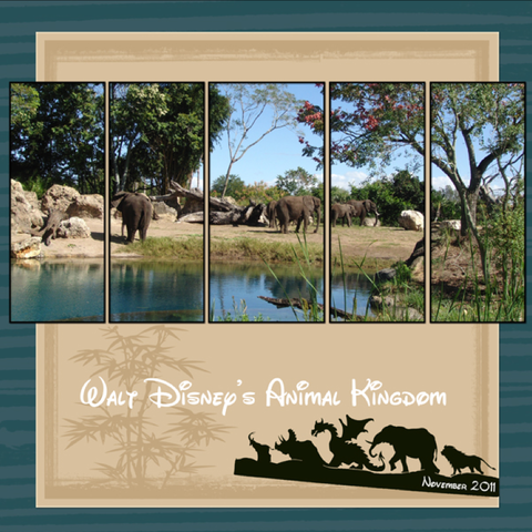
ritage's project has reminded me how good a Quintuptych can look. I think I prefer when a photo is divided into 5 sections. Looks so great. 
photo by cats4jan - graphic extracted from my photo of the Animal Kingdom sign. Font is called "Walt" and is a freebie somewhere. |
|
alexr
Established Forum Member
 
Posts: 555
Open to constructive criticism of photos: Yes
|
Post by alexr on Apr 1, 2016 18:58:24 GMT
Thanks for the tutorial, always a great way to learn new tips and tricks along the way too. In my mind's eye, I set off to convert a shot I took a couple of days ago (of the gilded gates at Hampton Court palace) as a triptych in the form of a 'hinged gate' if you see what I mean. It didn't quite work out that way but I thought I'd share it anyway. farm2.staticflickr.com/1656/26081988952_34acc53528_c.jpg |
|
Deleted
Deleted Member
Posts: 0
|
Post by Deleted on Apr 4, 2016 4:51:22 GMT
I have so enjoyed reading this thread and seeing every ones fine work. I love triptychs they are so interesting and as i see here there are so many wonderful versions.
|
|
|
|
Post by hmca on Apr 4, 2016 11:39:41 GMT
@ladybug....Judy, good to hear from you!
|
|
Deleted
Deleted Member
Posts: 0
|
Post by Deleted on Apr 4, 2016 14:49:27 GMT
So nice to be able to take a minute or two to join in. Thanks.
|
|