|
|
Post by Tpgettys on Mar 26, 2016 17:46:13 GMT
Howdy! It's Saturday and time for a new Creative Effects Challenge, and this time I have chosen a video Triptych tutorial. Besides being a great way to present an image in a new way, the approach used here was fun and taught me a few new Photoshop Elements tricks and also considerations for making the result more unified. Give it a go; I can't wait to see what you come up with! Of course if you run into any difficulties please ask your question here and it will be promptly answered. Here is the result of applying this technique to an image I found on Pixabay:  (Click for a larger view) |
|
|
|
Post by hmca on Mar 26, 2016 20:51:10 GMT
Thanks, Tom. I have always liked the triptych effect. I used a Sarah Gardner texture for the background. 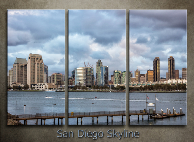 |
|
Squirrel2014
Established Forum Member
  Where's that cup of tea ... ???
Posts: 685  Open to constructive criticism of photos: Yes
|
Post by Squirrel2014 on Mar 26, 2016 22:52:32 GMT
Thanks Tom, for this challenge. I've wanted to try this for some time but just never got around to it. I found the video easy enough to follow, especially as I do like to hear Davro's voice, being nice and clear  So, here is my 1st attempt at a Triptych. The image is from Pixabayt. Maybe, I should have chosen a different picture as I found it difficult to find a match for the background. In the end, I decided to change the shape of each part and do away with any background  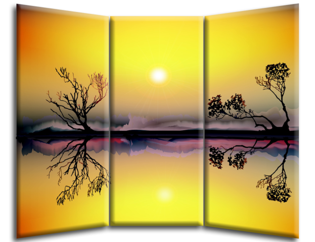 |
|
Squirrel2014
Established Forum Member
  Where's that cup of tea ... ???
Posts: 685  Open to constructive criticism of photos: Yes
|
Post by Squirrel2014 on Mar 26, 2016 23:44:47 GMT
Here's wishing you all a very Happy Easter  |
|
|
|
Post by Tpgettys on Mar 26, 2016 23:58:06 GMT
Three excellent starts to this challenge! The tutorial throws out the possibility of making horizontal panels; I wonder how well that would work?
|
|
|
|
Post by fotofrank on Mar 27, 2016 6:57:53 GMT
And now for something completely different - a little wave 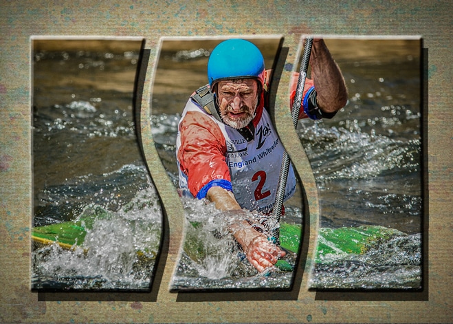 |
|
|
|
Post by cats4jan on Mar 27, 2016 11:33:06 GMT
Amazing how this simple effect comes out so different. They are all so good. I've never thought to do wavy pieces. That looks good, too. I'm sure horizontal would look good, too.
|
|
|
|
Post by Lillias on Mar 27, 2016 12:54:57 GMT
Pic from Morguefile Kit used; Ocean Dreams from Coolscrapsdigital. 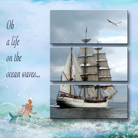 |
|
Squirrel2014
Established Forum Member
  Where's that cup of tea ... ???
Posts: 685  Open to constructive criticism of photos: Yes
|
Post by Squirrel2014 on Mar 27, 2016 16:36:02 GMT
I love all these different versions of Triptych's. So creative.
Frank, would you be prepared to share how you got the curves in your Triptych? It's frustrating me trying to figure out how you have done it. Did you perhaps do it in Photoshop rather than Elements???
Many thanks
Julie
|
|
Deleted
Deleted Member
Posts: 0
|
Post by Deleted on Mar 27, 2016 18:31:40 GMT
Thank you Tom for this great tutorial!! I love all the different takes on this. I pretty much followed the video, but going horizontal instead. Once done I changed the fill colour and then ran the whole thing through Topaz Texture Effects. 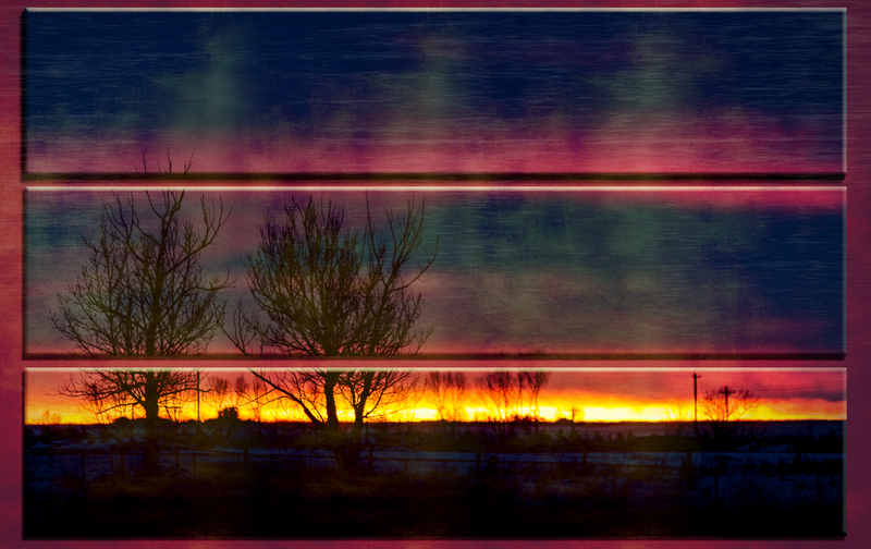 |
|
|
|
Post by Lillias on Mar 27, 2016 20:14:01 GMT
Photo from Pixabay BG from kit called Bird Garden by Victoria Nelson. 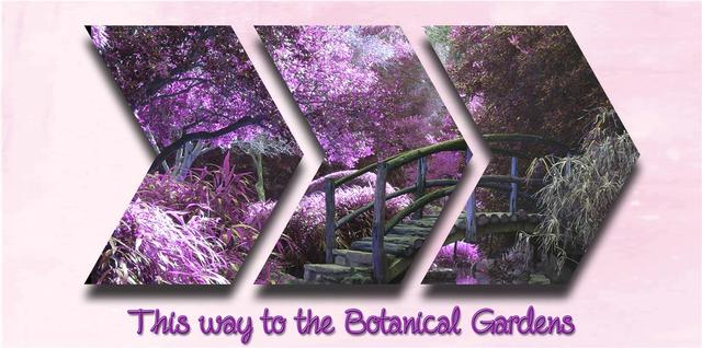 |
|
|
|
Post by Lillias on Mar 27, 2016 22:03:53 GMT
These are addictive… Pic from e-vint.com Kits ‘All Our Yesterdays’ and ShowMeYesterday’ by G&T Designs. 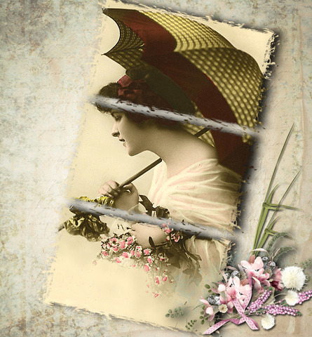 |
|
|
|
Post by hmca on Mar 27, 2016 22:55:15 GMT
Perfect pairing on the one above Billie Jean!
|
|
|
|
Post by fotofrank on Mar 27, 2016 23:08:35 GMT
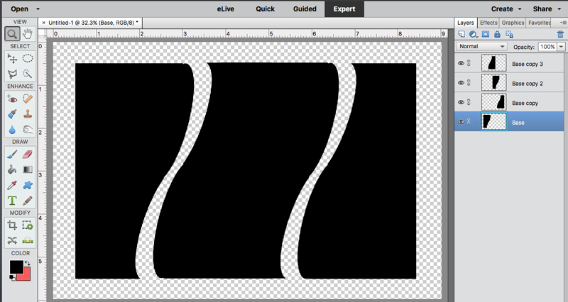 I'm pretty sure you can do this in elements. Create the one side, Flip it for the other side and combine them for the middle. The shape started as a rectangle then had a selection added and then another removed. |
|
|
|
Post by cats4jan on Mar 28, 2016 0:07:04 GMT
 Excellent tutorial. Would never have thought to use the crop tool to divide my photo into threes. Photo: DS#2; Kit: Savi's Vintage Rose from Just Art Scrapbooking (all recolored) |
|