alexr
Established Forum Member
 
Posts: 555
Open to constructive criticism of photos: Yes
|
Post by alexr on Aug 23, 2017 19:19:09 GMT
That is a great example, Sydney. Please don't be offended, but for me the colour image has very little going for it, no obvious subject, messy composition with the bicycle handlebar intruding and the figure not adding any interest. It would have gone straight in my bin. But in mono and processed with grain and high key it feels like a news picture and suddenly there is drama and yes, mystery. Who is he? Why is he there? Is the lady involved even though she is in the cafe next door? Fascinating, and a lesson to me.
|
|
|
|
Post by hmca on Aug 23, 2017 20:02:34 GMT
A very helpful analysis, Alex.
|
|
|
|
Post by Sydney on Aug 23, 2017 22:37:53 GMT
Cheers Helen and Alex, I really appreciate the feedback. Yes, you are right about the colour image being almost turfed out as the guy in it photobombed it by walking into the frame as I was about to take a shot. But afterwards, when I had a good look at it I thought I could do something with it, hence the reason I ended up taking it into Silver Efex for conversion.
|
|
|
|
Post by bryston3bsst on Aug 28, 2017 15:40:47 GMT
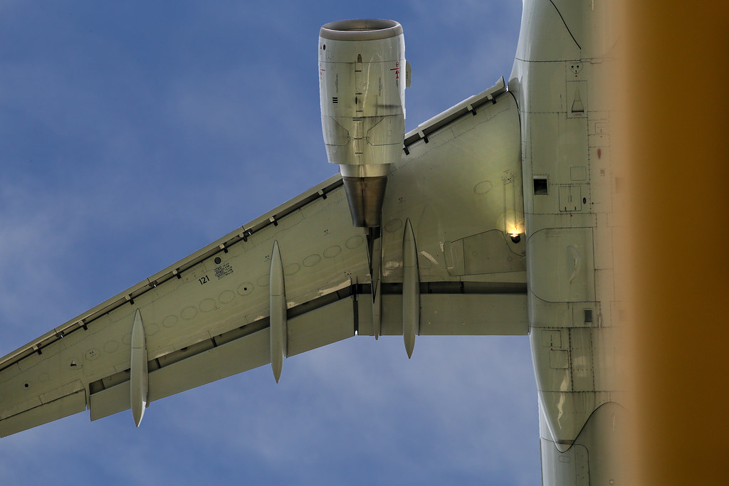
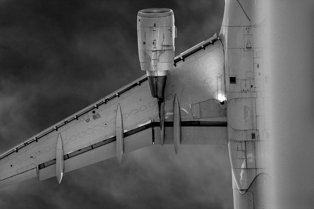
I caught this guy running about 50 feet above the ILS gantry I was standing under. I really like the color version but I thought I would try it in B&W.   |
|
|
|
Post by hmca on Aug 28, 2017 20:55:03 GMT
bryston3bsst ..........what a capture!!!!! I especially like the blue/orange color combo in the first. In the second the shape of the aircraft takes dominance. Would be interested in your thoughts on your image.
|
|
|
|
Post by Sydney on Aug 28, 2017 23:02:14 GMT
Nice capture. In my mind the b&w gives the image an artistic feel to it, like something one would see in an exhibition.
|
|
|
|
Post by bryston3bsst on Aug 29, 2017 12:16:30 GMT
Thanks, Helen. Actually, I like the color better as well for the same reason. I thought I would try the B&W for this but I think it causes the gantry to sort of blend in and the perspective kind of goes away. But I do like the way the aircraft and the sky converted in the B&W. Sydney.......and exhibition? Your lips to God's ear my friend....don't we all dream of that?  |
|
|
|
Post by bryston3bsst on Aug 29, 2017 12:35:14 GMT
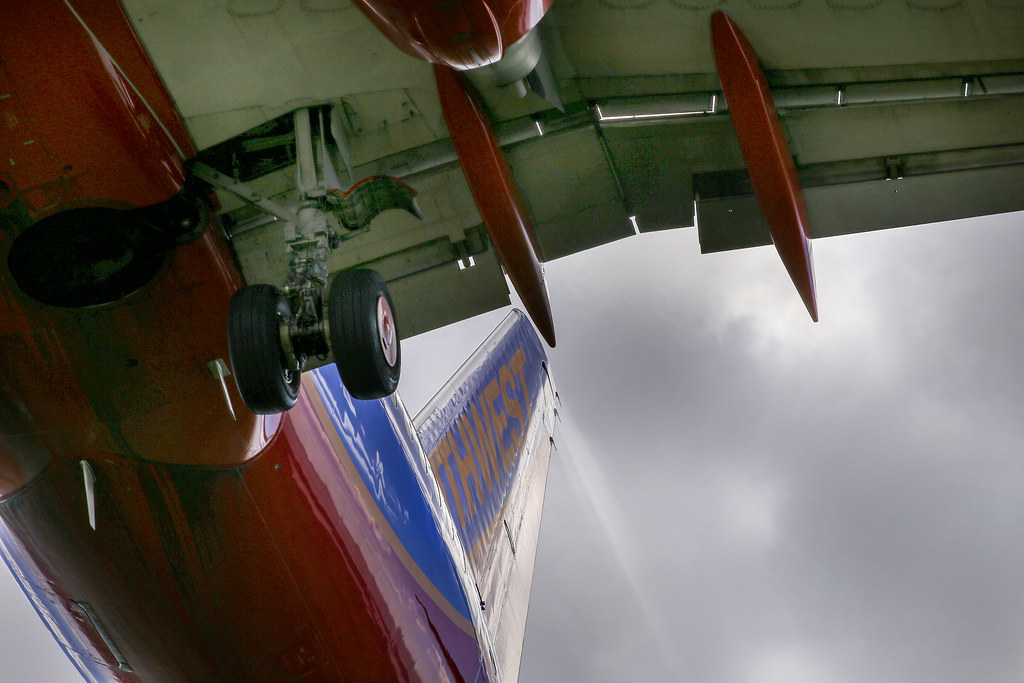
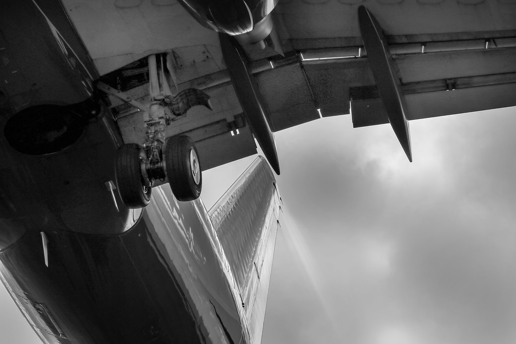
Tried another one. I was wondering if the conversion might make the vapor trail off of the tail more prominent......but it looks pretty much the same. I do like the way the sky converts. Interesting too how the logo on the rudder didn't covert at all, it just went away.   |
|
|
|
|
|
|
|
Post by hmca on Aug 31, 2017 2:49:41 GMT
preeb, black and white gives your barns a "yesteryear" feeling. Thanks for taking yet another look to see which images might convert well to black and white.
|
|
|
|
Post by hmca on Aug 31, 2017 3:00:18 GMT
I want to thank everyone who has contributed to this challenge. I hope you found it helpful to look back on past images with the idea of determining which ones might look well in monochrome.
When we think about creating a mood, emphasizing shapes, patterns or textures we can see where a black and white/monochrome image can help define our vision.
A new challenge will be introduced on September 3rd, but until that time feel free to continue to look back through your archives and share any images that you think make a good conversion.
Hopefully it will help you with the next challenge when you will be asked to go out and shoot with the
intent of creating monochrome/black and white images.
|
|
|
|
|
|
Post by hmca on Aug 31, 2017 19:29:28 GMT
Nice one, Rick!
|
|
|
|
Post by hmca on Aug 31, 2017 21:06:46 GMT
Storm in the distance made for some interesting light on the river.....   |
|