|
|
Post by hmca on Aug 3, 2017 15:24:51 GMT
As we begin our black and white challenge we want to think about what kinds of subjects are good for black and white conversion. What do we want the viewer to see or feel? 1. When I think about black and white photography I often think of images that have strong lines, geometric shapes and paths. Architectural shots work well. 2. The interplay of light and shadow can be emphasized. The viewer will have a different reaction to an image that is light and airy as opposed to one that is dark and mysterious. 3. Dramatic landscapes can be achieved by emphasizing the tone and contrast in the land formations and the sky. 4. Portraits were mentioned by Berengaria . Without the distraction of color, black and white helps the viewer concentrate on the essence of the person. Clothing, hats background all take on a secondary role. Additionally black and white is often favored for street photography. 5. Finally, color can be a distraction to images with a strong emotional component. drjoerogers recently posted an image of a kayaker in his gallery and then posted another one in black and white. He said he preferred the second one and I agree. Black and white brings out the tension the kayaker must have been feeling at the moment. So, while we will usually be asking you to go out and shoot with a particular theme in mind, for this first challenge, we are asking you to go back and look in your archives. Think about the key elements mentioned above and find some images that you think would be good candidates for black and white. Not images that you may have dismissed, but images with key elements that can be enhanced by converting to black and white. I know that this may sound like a backward step to many of you, but I think we can all learn a lot by this exercise. I would like you to post your original image in color and then another version in black and white. Please share what you used for your conversion. Remember this challenge is about sharing and learning together. |
|
preeb
Established Forum Member
 
Posts: 376  Open to constructive criticism of photos: Yes
|
Post by preeb on Aug 3, 2017 17:46:15 GMT
My first submission - B&W converted in Lightroom. I expect to do more in the next days. This is my wife's mother's stone. She was a piano teacher and played piano and organ for their church for some 50 years, thus the musical staff on the upper right corner. She was a farmer's daughter and a farmer's wife, signified by the shock of wheat on the left. She was also my pinochle partner and a great lady.  Original:  |
|
|
|
Post by hmca on Aug 3, 2017 18:03:42 GMT
Thank you preeb for getting us started. You have chosen an image with an emotional impact. It is interesting to read why the symbols on the stone were chosen. It would be helpful for this challenge if you could edit your post to include the color image and what you used to convert it to black and white. I look forward to seeing your additional entries. Thanks, Helen |
|
preeb
Established Forum Member
 
Posts: 376  Open to constructive criticism of photos: Yes
|
Post by preeb on Aug 3, 2017 18:16:00 GMT
Captain Jonathan (conversion in Lightroom)  Original:  |
|
Deleted
Deleted Member
Posts: 0
|
Post by Deleted on Aug 3, 2017 18:28:47 GMT
Here's my attempt. B&W is a subject I know anything about so I have watched a couple of youtube videos on the subject using Lightroom. The conversion and editing has all been done in LR. Click on the image for a larger view.   |
|
Deleted
Deleted Member
Posts: 0
|
Post by Deleted on Aug 3, 2017 18:35:03 GMT
Preeb. I really like your conversion of the headstone, and also the sentiment behind it.
|
|
preeb
Established Forum Member
 
Posts: 376  Open to constructive criticism of photos: Yes
|
Post by preeb on Aug 3, 2017 18:57:46 GMT
Phil - I clicked to get the 11mb high resolution image, and the detail that comes out in the rocks is excellent. There is a significant difference between the high and low res images. I've always felt that sharpness, contrast, and detail were an important consideration in converting to monochrome.
|
|
|
|
Post by fotofrank on Aug 3, 2017 18:59:03 GMT
Rome Trolley - conversion in NIK Silver Efect Pro 2 
Original File  Settings  |
|
preeb
Established Forum Member
 
Posts: 376  Open to constructive criticism of photos: Yes
|
Post by preeb on Aug 3, 2017 19:07:24 GMT
One more B&W Lightroom conversion, then I'll give it a rest for a while. This is Pilot Peak along the Beartooth Scenic Highway on the Wyoming/Montana border.  Original:  |
|
|
|
Post by bryston3bsst on Aug 3, 2017 20:47:59 GMT
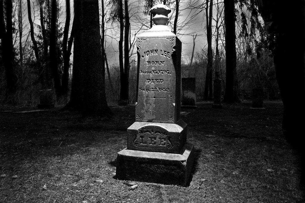
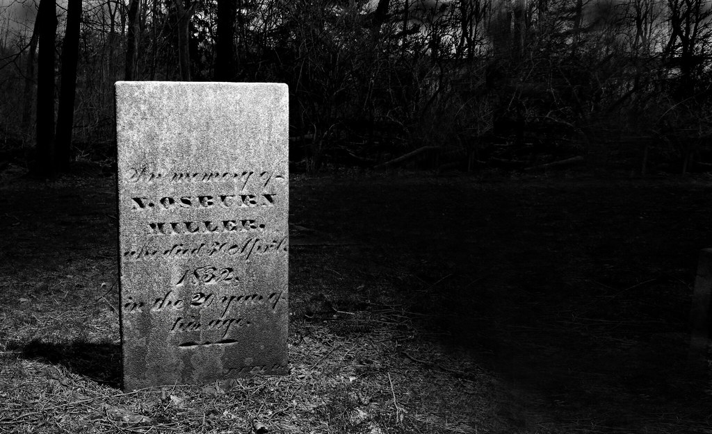
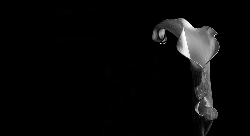
Cemeteries at night don't have much color even though these are conversions.   I was a tour guide at the Mansfield Reformatory for 16 years. This was the prison where Shawshank Redemption and Air Force One were filmed. The building was completed in 1896 and really lent itself to some nice, creepy black and white......as seen here.  ......and a Calla Lilly.  For most conversions I use Elements 14 and start with one of the 5 or 6 default choices, whatever looks best, and then work from there. Making changes as needed to get the effect I want, which is dictated by the initial image. Creepy images are usually harder contrast, whereas the flower above calls for something a little easier. Although I'm not much of a flower shooter. |
|
|
|
Post by PeteB on Aug 3, 2017 21:01:53 GMT
|
|
Deleted
Deleted Member
Posts: 0
|
Post by Deleted on Aug 3, 2017 23:44:32 GMT
Helen, thank you for getting us started on our new challenge, and thank you everyone that has already taken the time to post some of their conversions. Before I share my conversion with you, can I just remind everyone, that for this particular challenge we would like to see your "Before", i.e. colour version photo. This will help us all in seeing how the B&W conversion is doing the subject much better justice than the colour version. Here is my colour photo; it is a tree stump at the shores of a lake in the Canadian Rocky Mountains. As you can see, the green bushes in the background are taking quite a bit of focus off the tree stump and while some dodging and burning, plus some added clarity on the stump would help this, I believe a B&W version is called for.  As I use predominantley LR CC I did my conversion in that program. I used a preset called "Ansel", named after the great Ansel Adams (for B&W inspiration, and to view his work, visit the Ansel Adams Gallery website). I then blurred and darkened the background some more to ensure the focus is on the tree stump only. After that I increased the clarity some more to bring out the textures of the wood and finally added a slight dark vignette.  |
|
|
|
Post by hmca on Aug 4, 2017 0:12:11 GMT
preeb .....thanks for pointing out to Phil the detail that was brought out in his conversion. Those are the kind of comments that are going to help make this challenge successful. Looking at the color version of your gravestone the first thing that caught my attention was the orange vase.....in the black and white version my attention went directly to the details on the stone. @scania .....in your black and white landscape my eye travels the path of the stream to the clouds in the background. I like the definition you brought out in the clouds. I would be interested in the size of the image that you uploaded. As Phil has pointed out the high resolution image really makes a difference when viewing your image. bryston3bsst ......black and white really brings out the graceful form of your calla lily.....I don't think that would have been so clearly evident in a color version. I should have mentioned the moodiness that you created with your cemetery image conversions as well.... bryston3bsstPeteB .....black and white draws us into the tunnel and brings out the reflections in the water. Some of the things I noticed.....all members are invited to comment on the images submitted to this challenge. You posted while I was considering my comments,@storkington . Thanks for sharing the Ansel Adams link......can you tell us where you got the preset?
|
|
Deleted
Deleted Member
Posts: 0
|
Post by Deleted on Aug 4, 2017 0:27:15 GMT
Thanks for sharing the Ansel Adams link......can you tell us where you got the preset? I wish I could Helen, but I have hundreds of presets, and for the most part they don't give a name of either creator or website (although all of them are free to use). |
|
|
|
Post by PeteB on Aug 4, 2017 3:54:23 GMT
Helen
After reading your comment about my image, I realized that my processing (dodge & burn; adding a vignette; and sharpen the subject) was only applied to the b&w version. So for a better comparison, I processed the color version in the same manner and replaced the first posted color image.
|
|


